

More often than not, people think of playgrounds as play structures for children to have fun… and little else. What they don’t realize is that these creative spaces are actually so much more than that. They’re rich environments that shape kids’ learning, movement, and social development. Interestingly, one of the greatest contributors to all of this progress is color. Here’s how playground color theory can help define age zones and guide movement and even supervision.
It Doesn’t Have to Be Confusing
Many playgrounds have been designed with a riot of colors. They’re bright, chaotic, and serve no real purpose. These carnivals of color can be disorienting for kids. They may find themselves wandering across play zones and grouping together in large numbers. In some instances, kids may even become overactive as a result of being overstimulated by loud, bold colors covering playground equipment. Kids may end up more stressed than when they arrived.
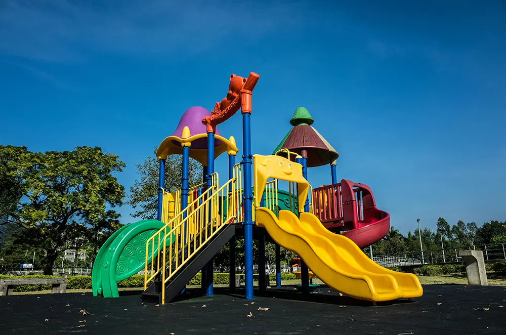
When playground designers apply color theory strategically and with intention, the structures become navigable. You can use distinct color palettes for different sections of the playground, like soft pastels in one space and deep tones in another. This creates clear transitions so children can self-navigate and flow through the entire playground with ease. You can also pair colors with signage to make the park more consistent and harmonious.
Wayfinding and Orienting Are Intuitive
In nature, different spaces come in different shapes and sizes. Humans learn to find their way by identifying patterns, recognizing changes, and repetition. On many playgrounds, however, kids and parents can quickly lose track of their orientation. Some traditional playgrounds may use physical barriers like fences to help people understand where they are and how to move. But far too many parks go without those cues, and the playground ends up feeling like a maze.
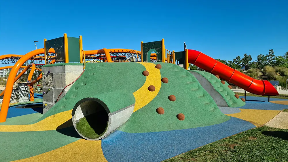
Modern playground designers are using color as a visual compass. Kids can dramatically improve their wayfinding abilities when structures include progressive color gradients. Designers can grade colors to transition from one zone to another, like shifting from warm reds at entry points to cooler blues deeper in the play area. You can even add pavement markings and rubber surfacing to help reflect these shifts, so kids and parents can create a subconscious path without needing to read a sign.
Age Zoning Guides Safety
Typically, children are separated by age on the playground. Structures meant for older kids able to take on more challenges stand apart from toddler and kinder areas with softer padding and shorter decks. Unfortunately, if both structures follow the same color patterns, kids of all ages will be drawn to both. This can pose a safety hazard for smaller kids who wander unwittingly into larger spaces that may be dangerous for them.
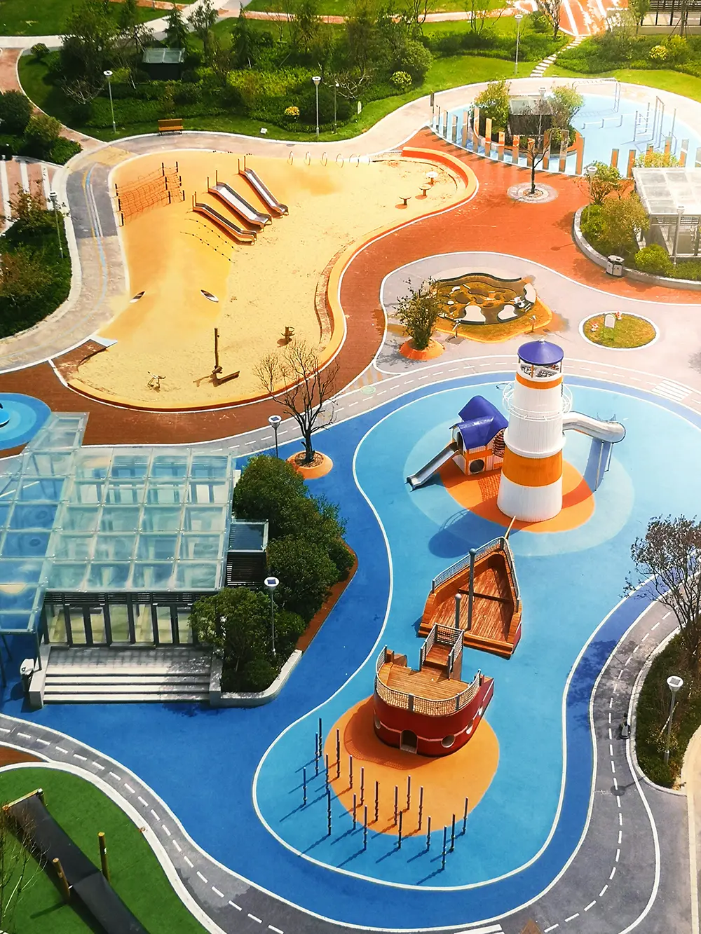
To avoid this confusion, designers can use developmentally informed palettes. These can signal which spaces are meant for which ages. Younger kids, at the toddler age, benefit from high, bright colors like pinks, pale greens, and soft yellows. You can also include rounded shapes and ground-level equipment to make the age range clear. For older kids, you can incorporate bolder, darker tones, like terracotta or cobalt. These tend to signify adventure to the daring children.
Supervision Made Easy
In the same way that kids find it difficult to orient themselves amid big, loud, chaotic coloring, parents also struggle to maintain supervision in these spaces. This is especially true if they have to watch more than one kid at a time, and those kids fall into different age ranges. Overlapping c;lor schemes and cluttered layouts make it hard to distinguish boundaries and spot your specific kid running across a busy playground.
The solution to this problem lies in contrast, lighting, and focal design. Color contrast is a critical safety tool in parks, and designers today are using contrasting background and equipment hues to make it easier for parents to find their kids among the chaos. In addition, playgrounds often now include light reflective materials and shade sails, so children are more visible throughout the day. Without thoughtful use of color and contrast, parents can take control of supervision and feel safer letting their kids play freely.
Color as Culture
Finally, so many playgrounds today use the same generic palettes: reds, yellows, blues, and greens. At this point, every park is starting to feel the same. The problem with this is that it lacks visual identity, which leaves little to inspire community pride. These bland and boring colors fail to reflect local culture, climate, or even environmental contexts. So the playground becomes a disconnected space, rather than one that integrates into its surroundings.
Color theory at its best serves branding goals within a community. Designers can pull inspiration from local ecosystems, architecture, or even cultural motifs. There’s no reason each playground within a community shouldn’t have its own unique identity. A coastal town could use seafoam green and coral. An urban park might use industrial colors like neutrals with pops of neon. When kids recognize “their” park by its colors, it’s now far more than a play space. It’s their landmark.
In the end, color can be treated as a functional design element instead of “just” a decoration as an afterthought. With intentional color, playgrounds can become safer, smarter, and more engaging for kids, parents, and everyone in the community. They can stand as points of pride that function beautifully and guide children and caregivers through an entire experience. Playground color theory helps transform a simple play space into an organized ecosystem ripe for exploring.