

Are you looking for interesting logo design ideas? Whether you’re creating a logo for your business, a project, or even designing a new logo for a client, it’s always good to get a little inspiration before you put your hand on the pen.
Your logo is your audience’s first introduction to your business, and it’s important to make a great first impression.
While you’re still in the brainstorming phase, take note of the different ways you can play with your design. There are fonts, colors, icons and layouts that all give off different messages, so you’ll want to mix and match before deciding on the perfect combination.
Below are 12 logos that have a few tricks up their sleeves; some contain hidden meanings, while others use geometric shapes to convey specific messaging that makes their audience fall in love. Check out these cool logos to get some ideas of your own:
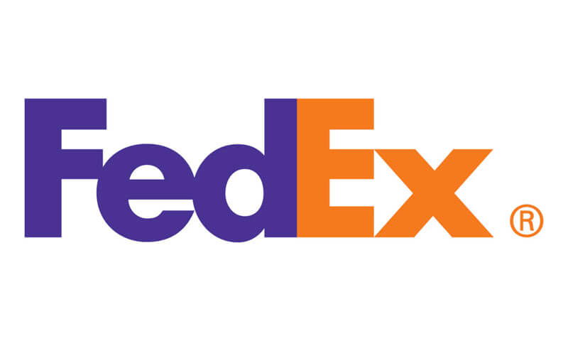
1. FedEx
This popular delivery service logo isn’t just memorable for its cool color contrast; it also contains a hidden message. Can you see what it is? The white space between the “E” and “x” doubles as an arrow, pointing to the speed with which the company promises to deliver its packages.
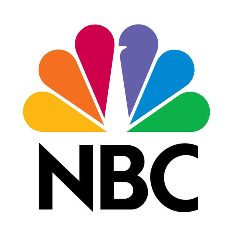
2. NBC
This network has a strong message behind its peacock-shaped logo—that they’re “proud as a peacock” of their color programming. Back in the day, while this logo was being created, color televisions had just hit the market, and NBC wanted to emphasize that they were one of the big networks using color film. On top of that, each feather represents one of the six different divisions of the NBC network.
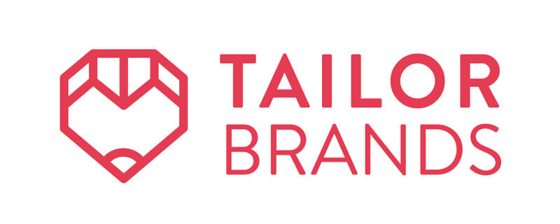
3. Tailor Brands
This automated branding company knows a thing or two about creating logos, and they put their knowledge to the test in their own logo design. The Tailor Brands icon is an abstract symbol containing geometric shapes with multiple meanings, symbolizing the versatility of their own logo-making platform.
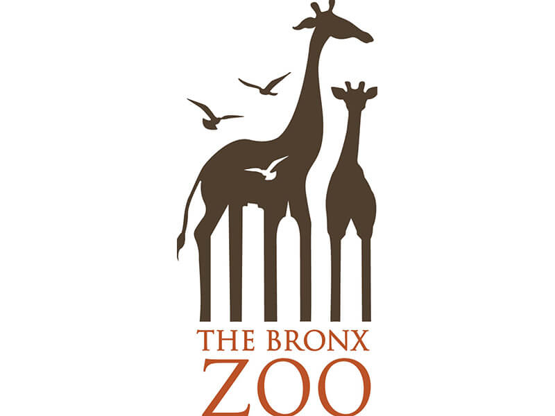
4. The Bronx Zoo
This is a great example of how you can use negative space to add another layer of meaning to your logo. The Bronx Zoo is located in uptown Manhattan, and that’s actually the visual focal point of the logo (can you spot the New York City skyline between the animals’ legs?). Not only does this zoo boast exciting animals, but it also invites its audience to explore New York—using the Big Apple as an extra way to tempt visitors to come see the zoo in the first place.
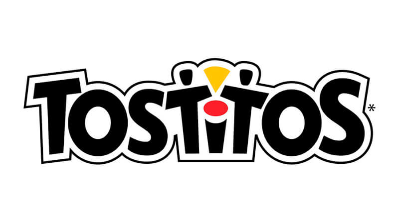
5. Tostitos
Notice the small pops of color in an otherwise all-black logo; by making the colors only take up a small piece of logo real estate, the design immediately draws the eye to those places and allows us to notice the two “people” sharing a tortilla chip in a pile of salsa—making you imagine the taste of the product the second you look at the design.
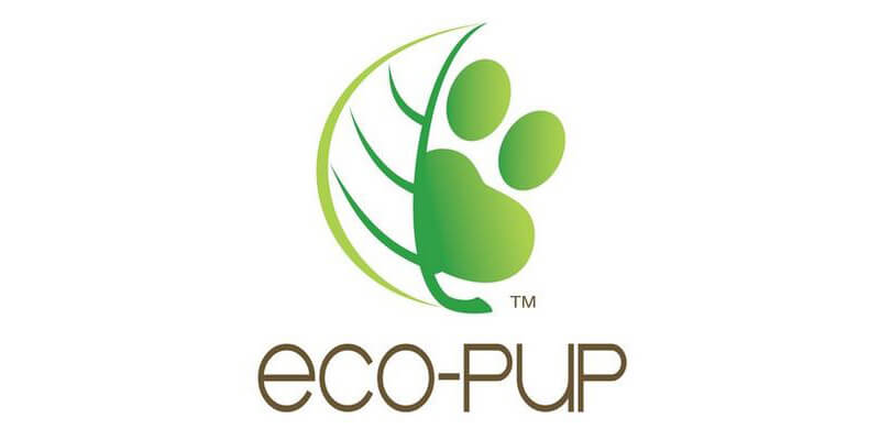
6. Eco-Pup
Here’s a logo that’s both playful and meaningful. While using the unique symbol of a blended leaf and paw print, the design immediately conveys a brand that caters to the environment and to animals all in one.
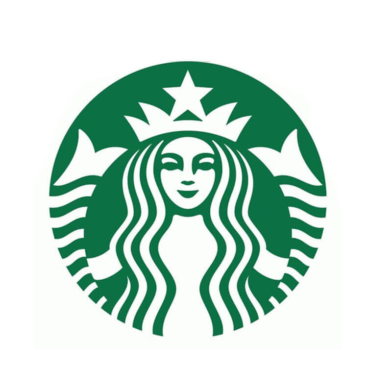
7. Starbucks
We’d be remiss not to mention this iconic brand. Starbucks’ logo has gone through a number of transformations, with their most memorable logo featuring the world-famous siren. Based on mythology, sirens were creatures that lured sailors to the sea, just like the coffee house chain lures customers to its beverages. And, the brand has a special connection to the water, as Starbucks was born in the port city Seattle!
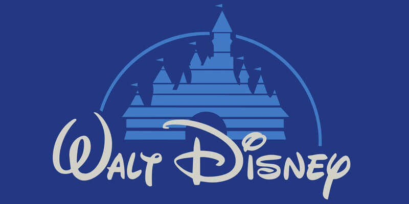
8. Walt Disney
Is Disney considered cool? In the logo design world—yes. This logo exudes fantasy and magic, practically transporting you to a fairytale just through the arc over the castle. It uses playful and energetic typography that gives off a family-friendly vibe and instantly lets viewers know that it’s a brand geared toward making children happy.
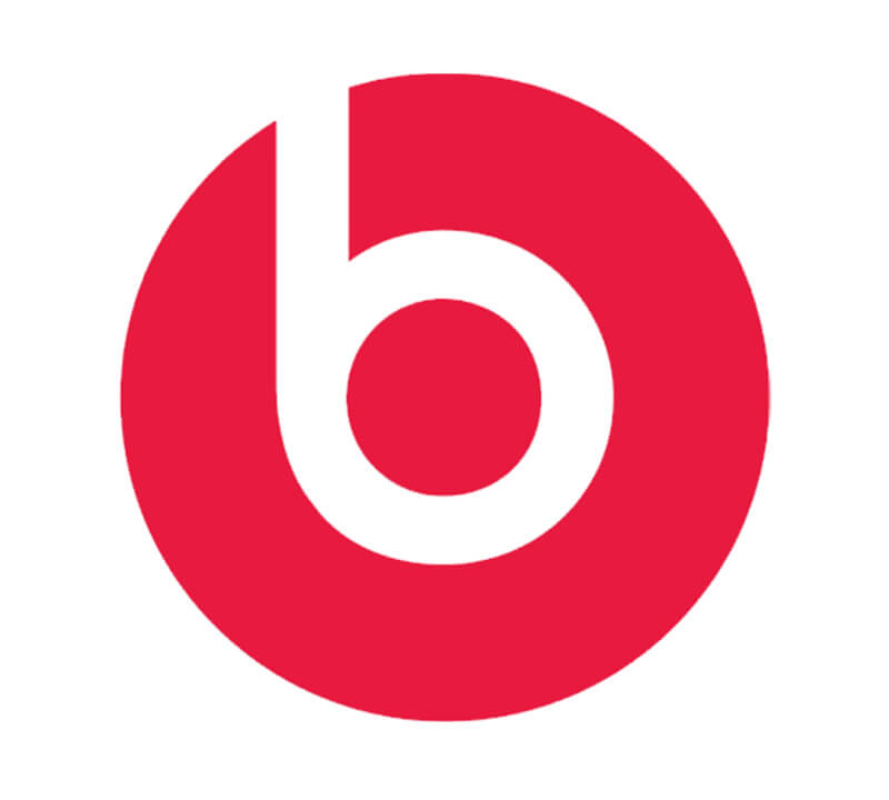
9. Beats by Dre
Occasionally accompanied by a wordmark to go along with it, this well-known logo has a double meaning. To start with, the “b” represents the first name (seems obvious, right?). But on closer look, you’ll see that the “b” also resembles a headphone, with the circle around it standing in for a person’s head. Nothing makes for a better logo than one that can simultaneously remind its audience what the company is called and what they offer.
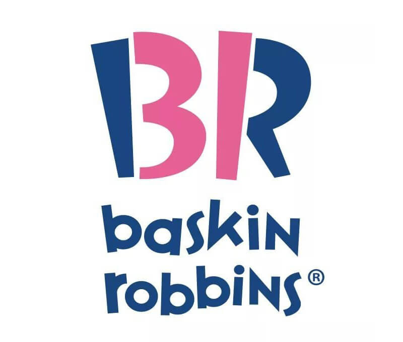
10. Baskin Robbins
Another classic, this brand has turned from a single store into a full-blown ice cream empire over the years. Their logo has somewhat evolved with time, but they’ve never strayed from their original message: 31 flavors, one for every day of the month. And, they’ve cleverly incorporated that promise within the initials of the brand, reminding their audience that Baskin Robbins is the one to deliver on that promise.
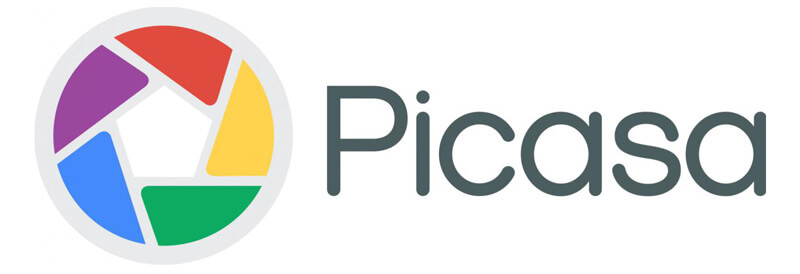
11. Picasa
Although the company is now discontinued, the Picasa logo is still worth mentioning on the cool list. What’s great about this logo is that it looks simple at first glance—a camera shutter in several different colors. However, the image organizer makes great use of white space; notice the house-like figure that stands in between the colors? It sends the message that its platform is the perfect place to house all of your photographs.
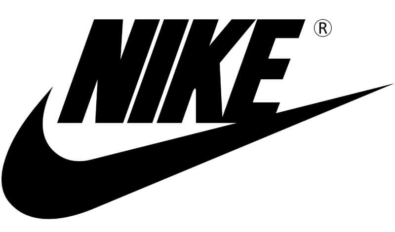
12. Nike
Last but opposite of least, the Nike swoosh is by far one of the world’s most revered logos—and for good reason. It’s simple, it’s memorable, and most importantly, it inspires its audience to take action, which is the mark of a logo that did its job well. If you’re looking to design a cool logo yourself, the Nike logo is a great design to draw inspiration from.
Ready to Design Your Logo?
Now that you’ve seen some cool logo designs, it’s time to create your own! Remember to play around with different color palettes and fonts, and try to think about creative ways in which to use white space. As you saw above, cool logos often have multiple meanings, so think a lot about the values behind the company you’re representing and the message you want to get across before you start designing.