The world of logo design is full of examples of logos that are extraordinary both in terms of their creativity and the meaning that they manage to convey. Even still, there are a few logos that manage to rise above the pack. These timeless logos represent the best of the best in regards to creativity and meaningfulness and are certainly examples that logo designers everywhere can strive towards.
Mercedes-Benz Logo
For decades, the three-pointed star of the Mercedes-Benz logo has adorned some of the most coveted luxury vehicles in the world. The design itself is everything that a logo for a luxury car company should be – simple, elegant, and yet instantly recognizable. However, the no-nonsense design of the Mercedes-Benz logo also manages to convey a message important to the company.
Mercedes-Benz explains that the three stars of the logo are meant to represent the company’s dominance over land, air, and sea. After all, cars aren’t the only vehicles that Mercedes-Benz helps produce as the company has equipped both airplanes and boats with their high-quality engines as well.
Apple
Few logos in the world are more iconic than the Apple logo. While the popularity of the products adorning this logo are a big part of the Apple logo’s popularity, there is still plenty to be said about the staying power and creativity of the logo’s design.
For Apple, the meaning behind the apple with a bite out of it is two-fold. For one, it represents the irresistibility of Apple products by comparing them to the irresistibility of the forbidden fruit that led to the fall of man in the Bible. The second meaning behind the logo is something of a play on words as the “bite” out of the apple is meant to also represent the software term “byte”.
Amazon
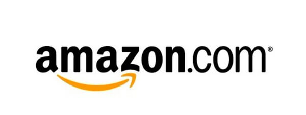
The undisputed king of online shopping, the retail giant Amazon is poised to play an increasingly significant role in how customers shop as the years progress. It turns out, though, that their logo is just as creative as the company’s innovative approach.
The Amazon logo may look simple at first glance, however, the curving arrow beneath the logo’s text manages to convey three different messages. On the one hand, the arrow shows the company moving forward. It’s also curved to look like a smile, showcasing Amazon’s friendly approach and warm customer service. Lastly, the arrow starts at the “A” in Amazon and ends at the “Z”, highlighting the fact that Amazon offers everything from A to Z.
Baskin Robbins
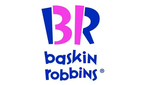
The creative design of the Baskin Robbins logo enables them to incorporate one of the company’s main selling points in a way that you might not even notice upon first glance.
For years, Baskin Robbins has advertised that they offer 31 different flavors of ice cream, providing customers with plenty of variety and choice. If you look closely at the Baskin Robbins logo, though, you’ll notice the number 31 within it made using the right side of the “B” and the left side of the “R” in the logo. This hidden message along with the logo’s fun font and color scheme highlights everything that customers love about the popular ice cream company.
FedEx
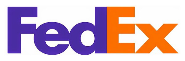
Few logos make better use of negative space than the FedEx logo. At first, the logo may look like a pretty standard typographic logo without much going on. If you look closely at the negative space between the “E” and the “X”, though, you’ll notice a perfectly formed arrow pointing forward.
The FedEx logo manages to remain incredibly simple while at the same time conveying the message that FedEx is forward driven. The end result is an excellent example of how simple, typographic logos can still manage to be incredibly creative and meaningful.