

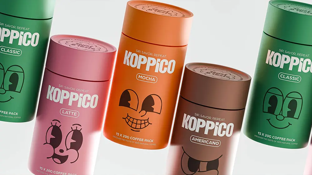
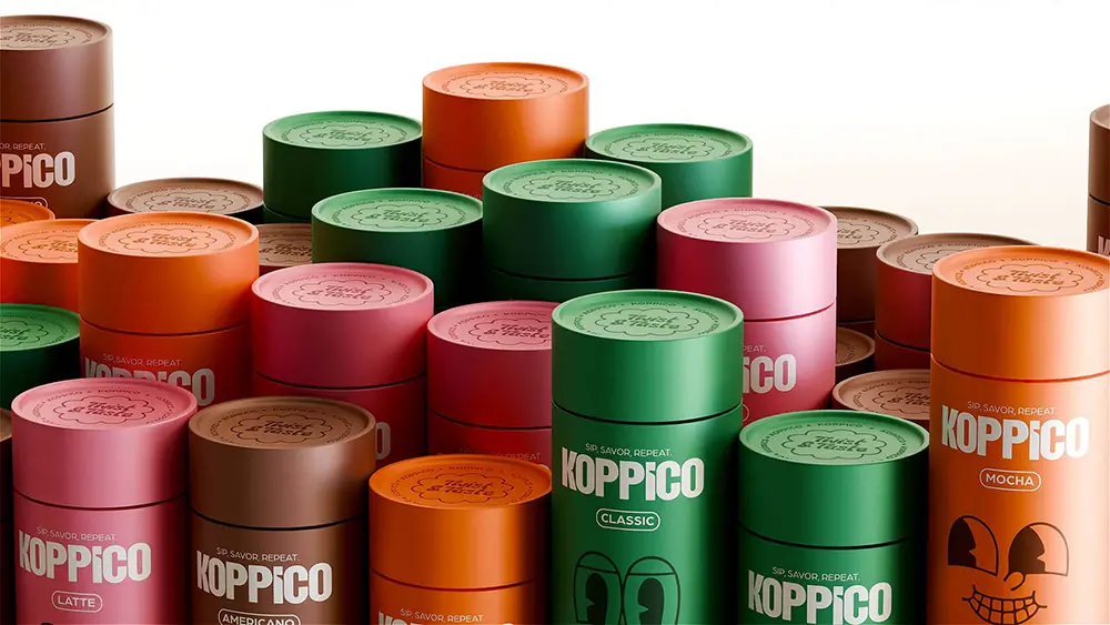
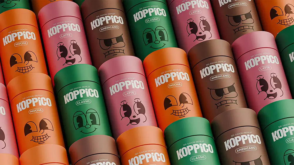
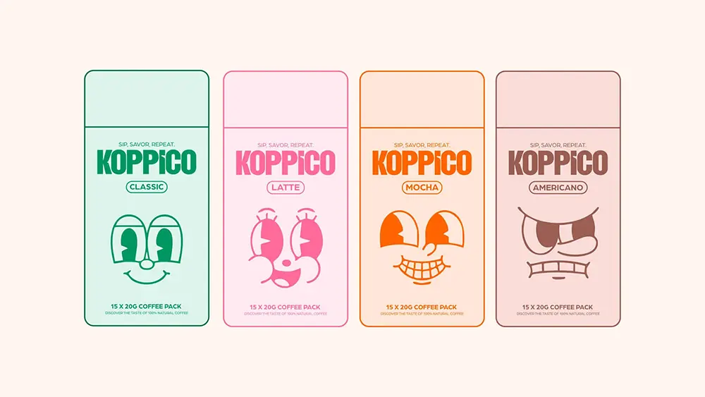
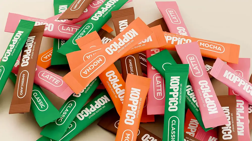
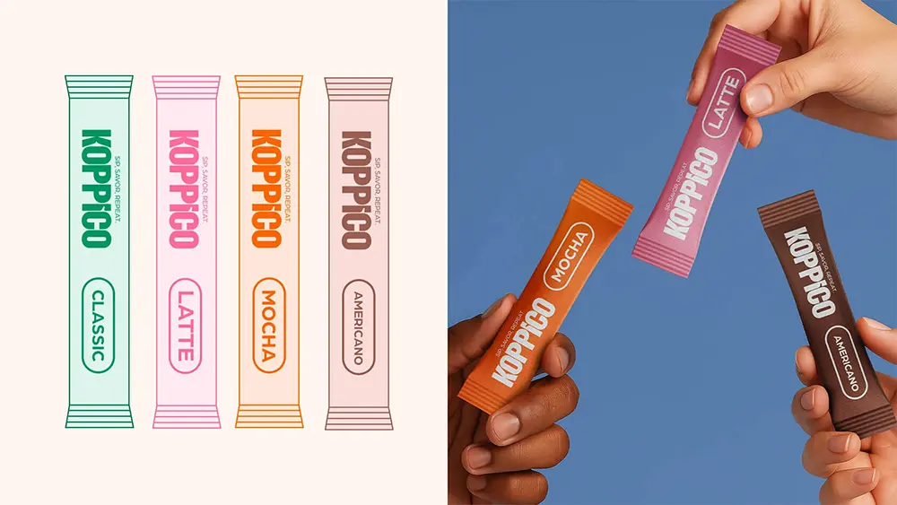
Turkish design agency Venore Creative has given coffee a fresh personality with its playful identity for Koppico coffee. Instead of sticking to traditional branding, the studio crafted colorful, character-driven packaging that reflects the mood of each blend—latte, mocha, americano, and classic. Every cylindrical container feels like its own little character, turning your daily brew into something more expressive and fun.
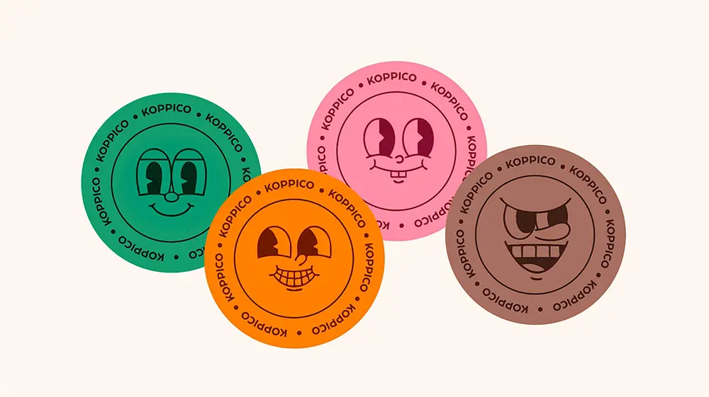
What makes the packaging pop is the mix of bold colors and illustrated faces, giving each blend a unique vibe. Some designs feel cheerful and calm, while others lean nostalgic or no-nonsense. It’s a clever way to connect with coffee drinkers, making the packaging just as memorable as what’s inside.
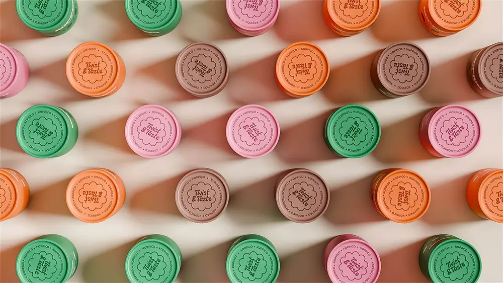
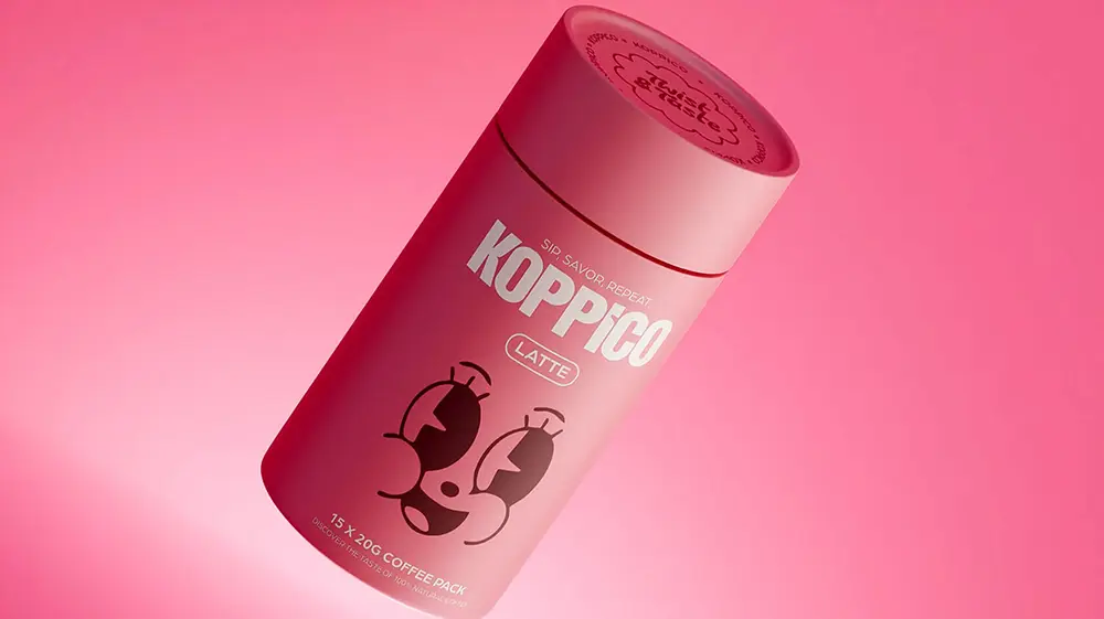
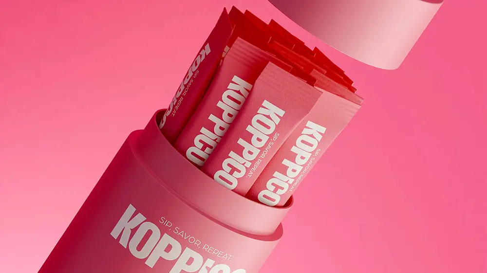
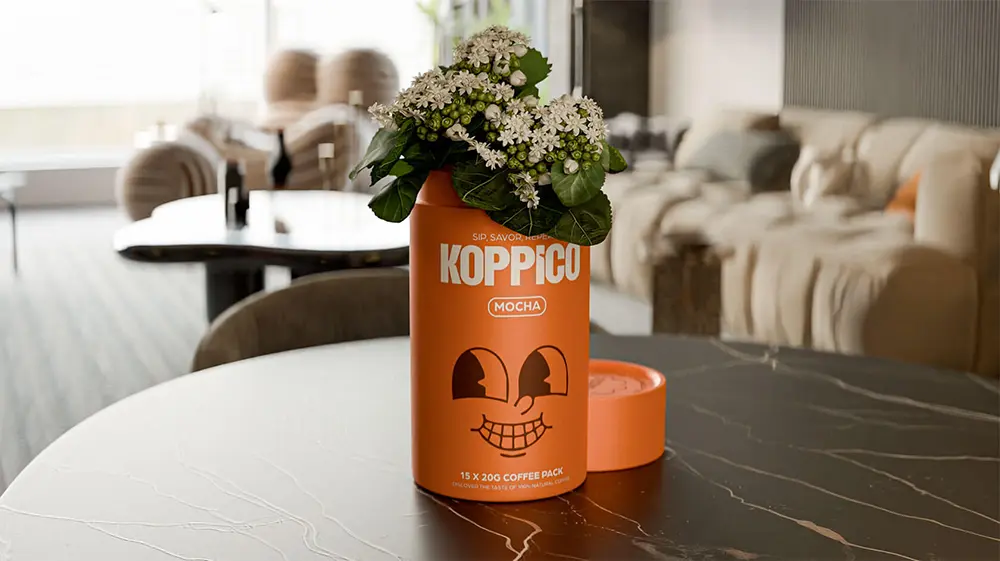
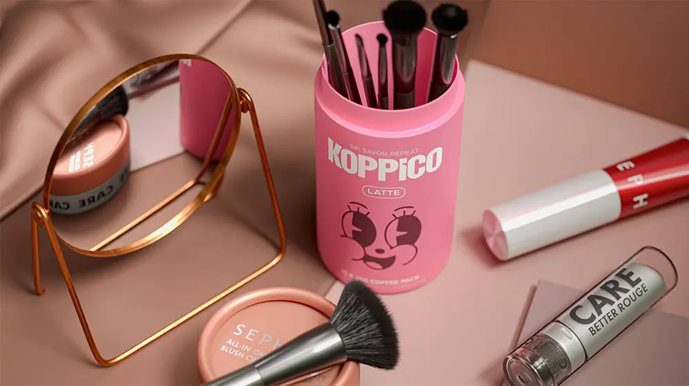
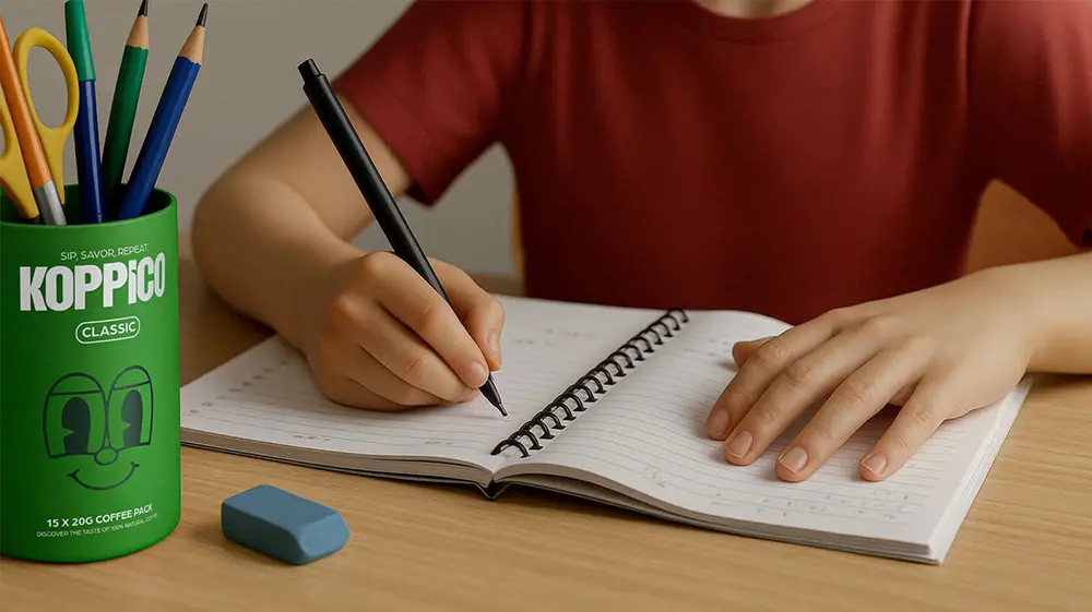
But Koppico isn’t only about style—it’s also about sustainability. The eco-friendly paper containers are printed with natural inks and designed to live on long after the last sip. Whether reused as a plant pot, pencil holder, or even a makeup brush organizer, the packaging keeps its charm while encouraging a more sustainable lifestyle.
Venore Creative’s work for Koppico shows how smart design can transform something as simple as coffee packaging into a talking point. It’s vibrant, eco-conscious, and full of personality—a winning combination for coffee lovers who care about both flavor and design.
You can explore more of Venore Creative’s Koppico coffee packaging and other projects on their website, Instagram and Behance.