

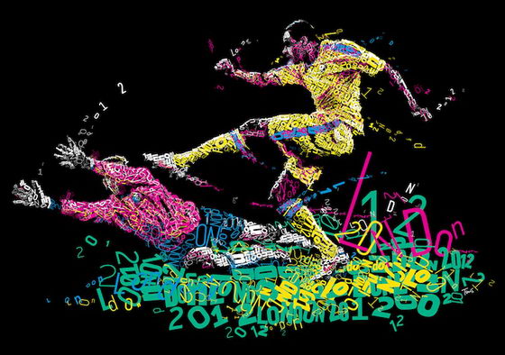
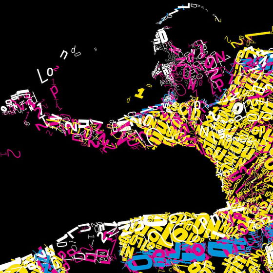
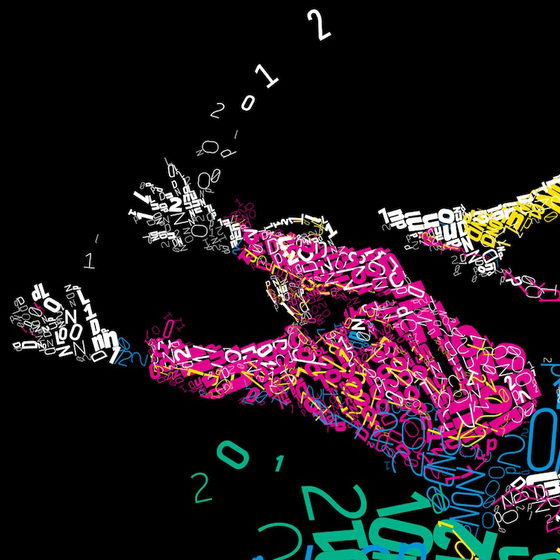
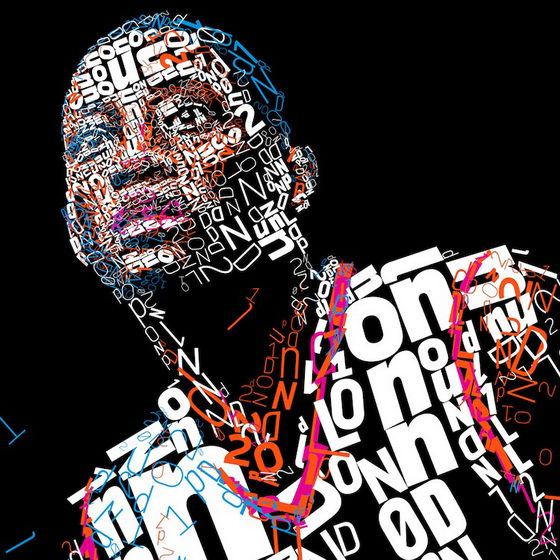
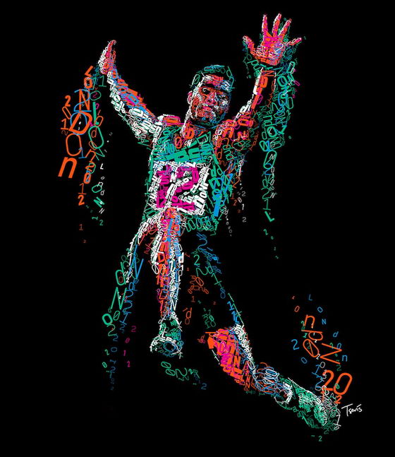
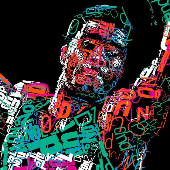
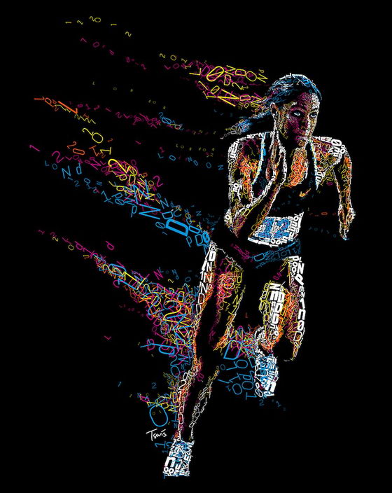
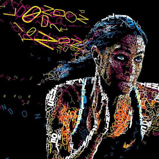
Greece-based designer Charis Tsevis just put out a series of experimental typographic illustrations inspired by the London 2012 Olympic games. This is the result of some experimentation on the London 2012 subject during the last 3 months. From the official identity Charis has kept only the color palette. We love his choice of colors and how the type is placed so that it gives the illusion that there’s motion in each piece. Besides the Olympic part, the idea behind this work is hoping people would understand the relationship between the typographic collages of the Punk Rock era and the ASCII art-inspired computer graphics. Charis just love to build virtual bridges between different visual communication ideas! Really impressive work! Well done! [source]


thanks for sharing, one of the collage done by me is at
http://mnmportfolio.blogspot.com/2011/11/text-collage.html