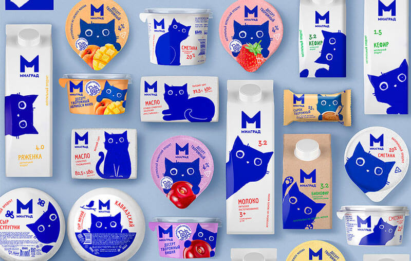
Milk products remain more than 22% of Russian FMCG market but dairy branding has stuck in recent years. Competition is high and it’s hard to stand out on the shelf. Brand Milgrad by Bryansk Dairy Factory is known as the first trade mark which brings happiness. To keep the brand strength and enforce its identity, the branding agency Depot decided to create something really cute and kind to help the products pierce the consumer’s heart.
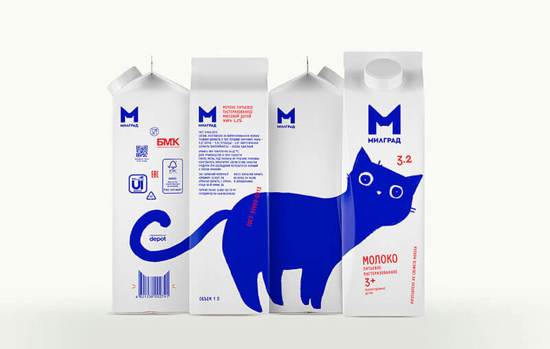
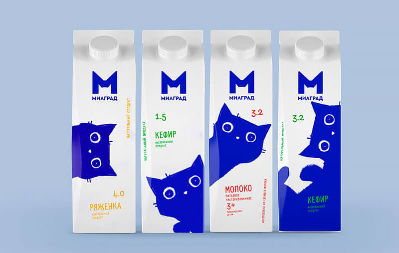
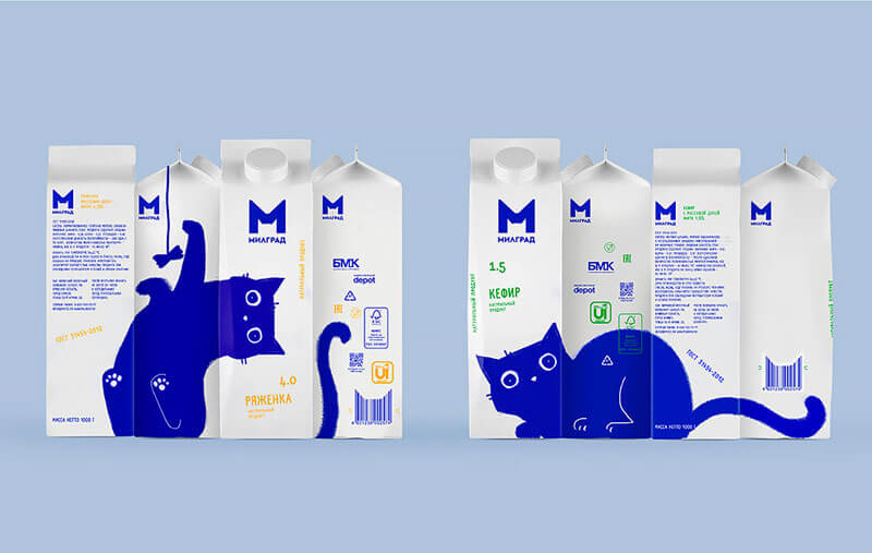
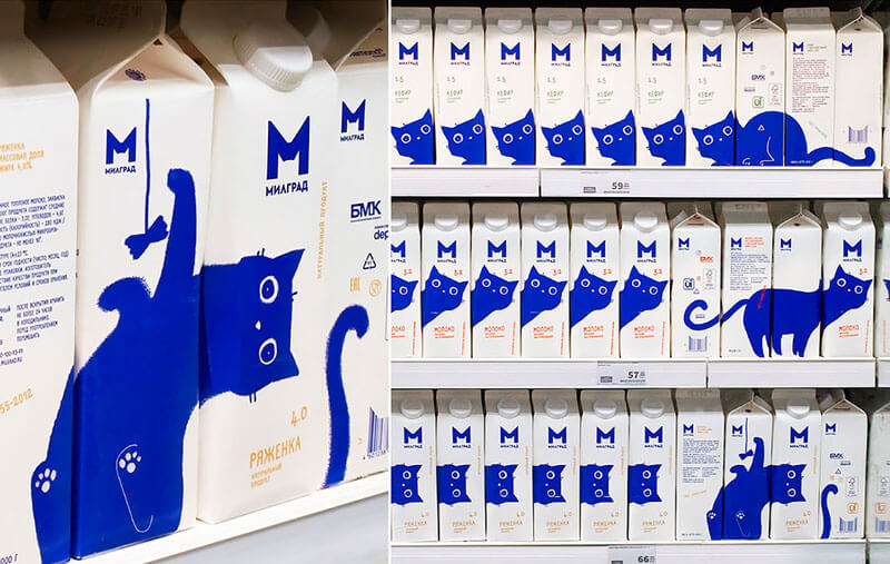
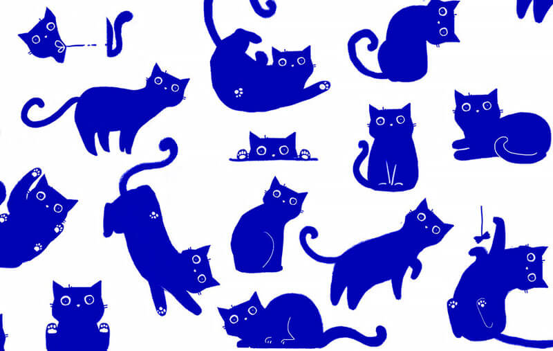
The blue cat travels across the packaging of different dairy products. It stares with interest, plays with a string, spies and skips a beat with expectation. The illustration starts from one side of the packaging and continues on the other, so it’s possible to interact with it straight from the supermarket’s shelf layout.
Besides the cute blue cat on the package, the logo has been redesigned in a more lighter and moderner way. M is for milk. M is for Milgrad as well. M looks like kitty’s muzzle.
How do you like this design? I think it is a quite brilliant! Especially the good thinking put in the logo. That is one of the best and creative logo design I’ve seen recently.
More: Behance