

When you think of a brand, often the product isn’t the first thing that comes to mind; it can be the logo instead, such is the psychological impact that branding can have on the human mind. In this regard, some brands have become so defined by their logo that they no longer even need to spell out their full name, with the iconic PS used by PlayStation one example of how a company has used the stylish design of their logo to create a bold impression.
Brand logos are statements from companies that can make or break reputations, and often can’t be redesigned as quickly or readily as a statement home kitchen or even a designer home bar area. Or, rather, they can, but shouldn’t. That said, logo evolution isn’t always a bad idea; in some cases, logo changes have had radically positive impact on company success and sales.
Coffee Chains: Standing out in a Crowded Marketplace
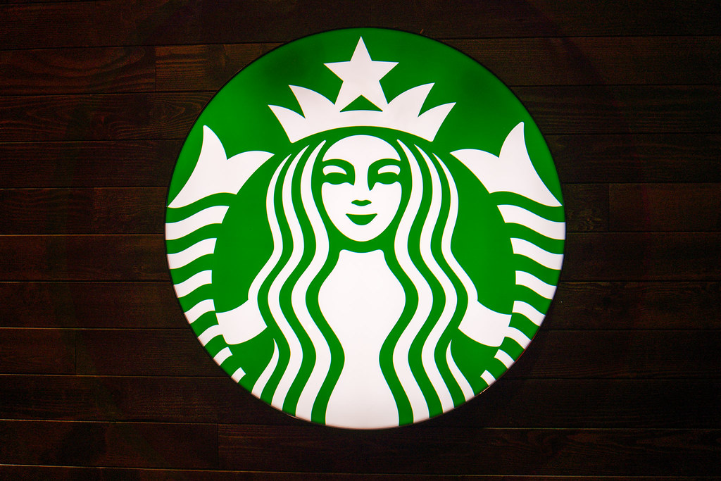
Sometimes, the evolution of a logo can be seen as a sign of a company being in trouble and needing re-invention. In the case of Starbucks history, however, the logo changes that have taken place have actually been put in place to reflect the growth of the brand. Indeed, the most recent change to the logo in 2011 – while not hugely popular with designers – was made in order to remove the singular association between coffee and brand; after all, Starbucks do not solely serve coffee. The new branding might not have won over all of Starbucks’ critics, but the continuing success of the brand and the fact that the company is now looking to food growth to drive sales proves that this strategy of changing their logo as part of altering their brand positioning is paying off. While other coffee chains such as Tim Hortons have the opposite attitude, pushing a consistent and memorable typeface, the fact that Starbucks now only use an image of a siren on their branding highlights that to stand out as a logo, words aren’t always needed.
Success and Failure, or The Problem of Being Too Edgy
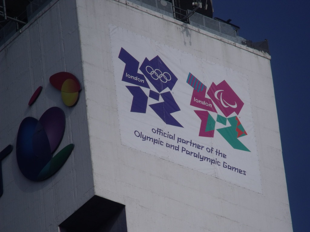
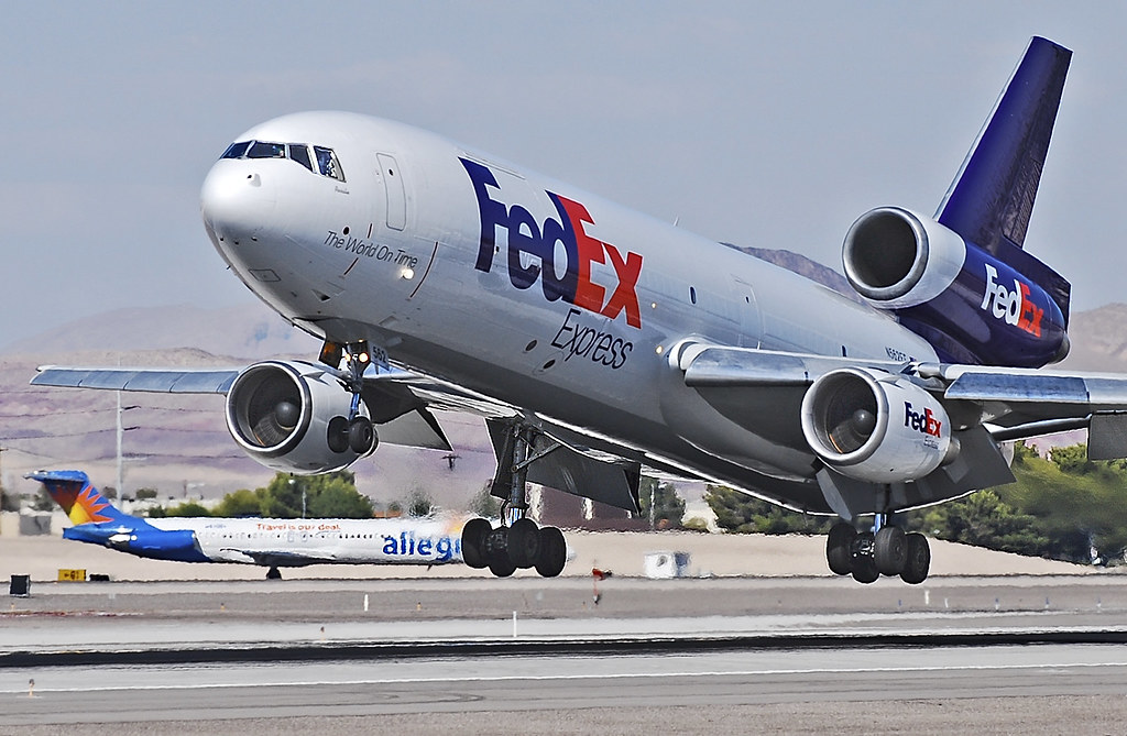
Making a brave move like Starbucks is one thing, but it is possible to go too far in this respect. The London 2012 Olympic Logo is regularly featured on lists of the worst designed logos and should be seen as a warning for those trying to be too edgy. While there are many unfortunate connotations that could be drawn from this logo, some threatened to cause real problems for the event itself. The Iranian government even seriously considered a boycott of the event and, although they eventually relented, by choosing such an edgy typeface, the branding damage had been done, to an extent, to the London games. On the other hand, if you consider that FedEx deliver over 9 million packages per day globally, Walmart had global revenues of over $480billion in 2016, and eBay has long since outlived many of its early rivals since being founded in 1995, it is no shock to see these brands included in lists defining the best brand logos.
Physical and Online Casinos: Keeping It Classy
Perhaps more interesting, though, is if you scratch beneath the surface and look at how brands in highly competitive industries may have been influenced by different trends in typeface, including the minimal approach we’ve seen from eBay and Walmart. Online brands such as Betway Casino, for instance, uses the same sober logo style that has served eBay – as well as casino game developers like Playtech – so well. The focus is purely on the brand name, and the simple color distinctions help to draw the eye in on a webpage. This stands in contrast to the rather less sober logo equivalent from the likes of Ellis Island Casino in Las Vegas, The Venetian, and MGM Grand, with the latter two drawing upon animals for their logo themes.
In an article from Betway Insider, they go into explaining about online slots, some manufactures work on the psychology of familiar themes in securing popular brand tie ins such as Jurassic Park the movie and Game of Thrones the popular TV shows. Even with land based slot machines names after “Elvis Presley” is a very popular local slot machine in Las Vegas.
Ultimately the use of logos manage to fit in with the slightly more over the top theme of Las Vegas and the fact that they work well in Las Vegas shows that as well as typeface and design credentials, the location of a brand also impacts upon precisely how effective a logo can be.
Evolving with the Times
Of course, whatever industry brands operate in, the most important thing is to allow for company evolution over time. If a company has outgrown its logo, or an industry has changed to such an extent that logos look stale, it is time to adapt. While some poorly planned logos like the London 2012 one don’t get this chance, the key lesson to take from failed ideas like this is that the logo a brand produces can be ruined by the wrong typeface that inadequately defines the brand.