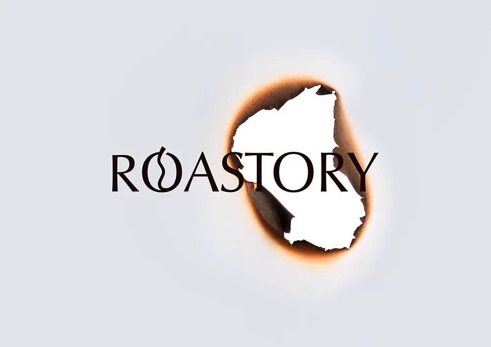
When it comes to coffee, the experience isn’t just about taste—it’s about aroma, heat, and story. That’s exactly what Taiwanese art director and designer Lung-Hao Chiang captures in his work for Roastory coffee packaging.
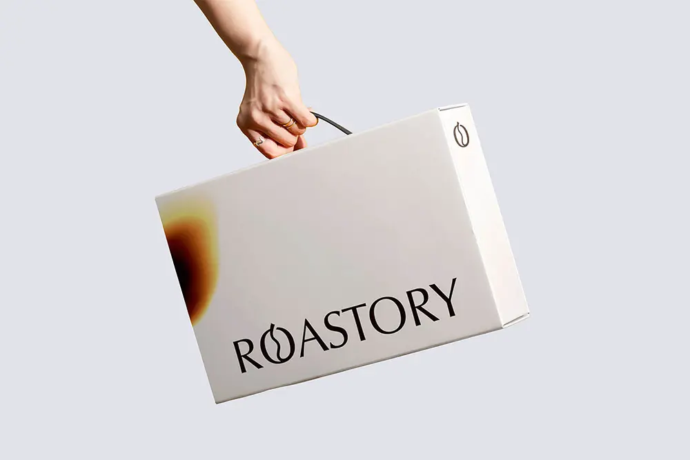
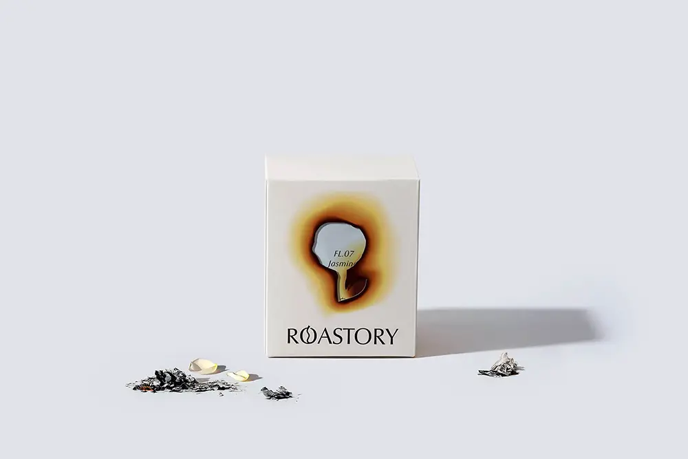
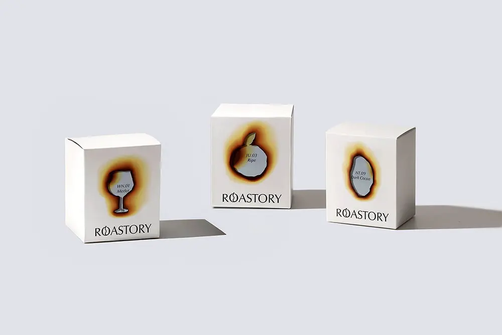
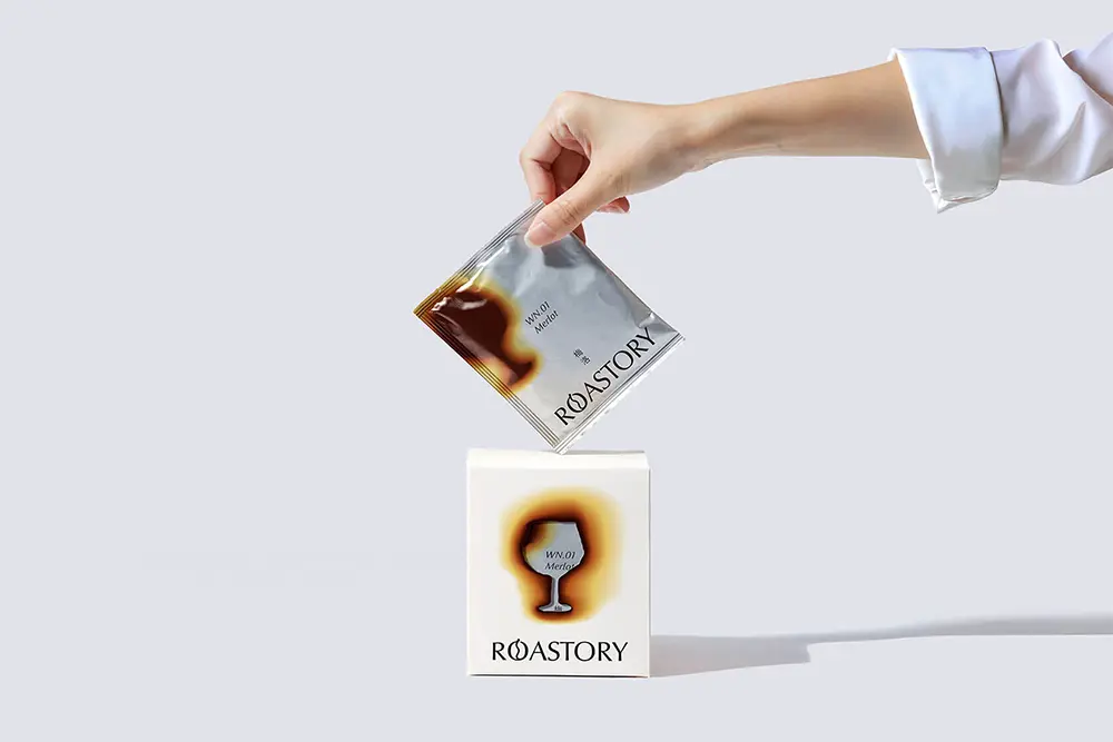
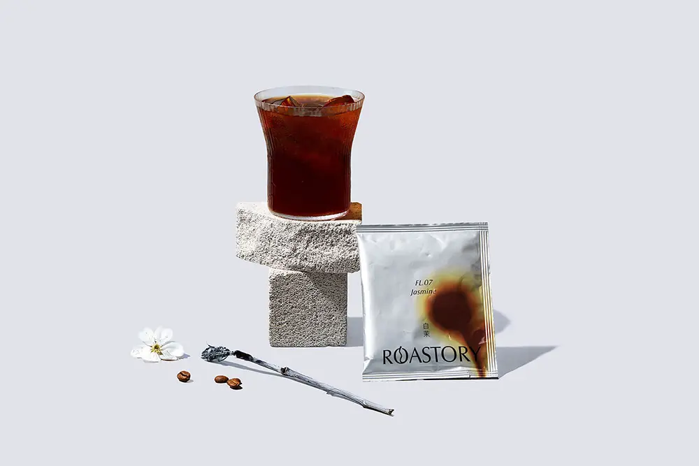
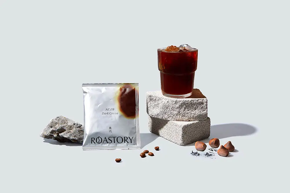
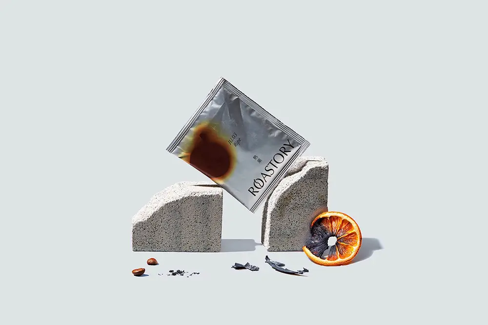
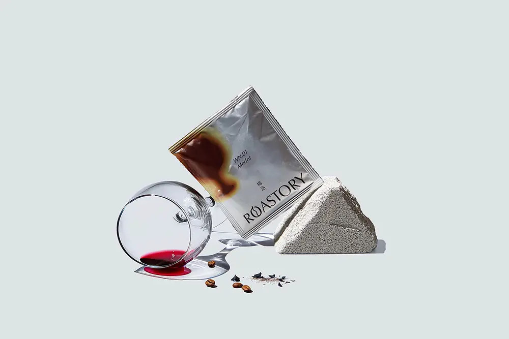
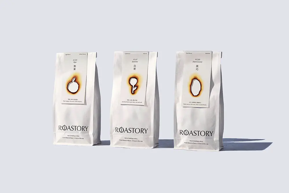
The brand name itself is a clever play on words, blending “roast” and “story” into one idea. From there, Lung-Hao built a visual identity that literally brings fire into the design. Each coffee bag and box features a scorched cut-out, allowing a peek at the blend or variety inside. It’s as if the packaging itself has been touched by the roasting process, instantly tying the design back to the product.
What makes this concept so engaging is how it balances raw energy with clean design. Instead of going for the glossy, sterile look we often see in premium coffee brands, Roastory leans into something more authentic. The edges of the burn marks reveal warm caramel tones, while smoky gradients sweep across the labels. You don’t just see the roast—you can almost feel it.
This approach transforms everyday packaging into a sensory experience, one that mirrors the ritual of making and enjoying coffee. It’s storytelling through design, where the visuals carry as much weight as the flavor inside.
With fire-inspired design elements that evoke aroma and heat, Roastory stands out as a brand that knows coffee is more than a drink—it’s an experience. For those who love design with meaning, Lung-Hao Chiang’s work is worth exploring further.
You can check out more of his projects, including Roastory, on his Behance and Instagram..