

Slides drifting a pixel, swapping fonts, or losing the logo? The PowerPoint Slide Master—found in View → Slide Master—solves all three in one place. Set your fonts, colors, placeholders, and backgrounds once and every slide falls in line. The catch: real styling lives on the child layouts beneath the master, so edits in the wrong spot won’t appear. Over the next five sections you’ll pick up designer-tested tricks (plus a few AI-assisted boosts) to keep templates tight. Note: you still need the Windows or Mac desktop app to edit a Slide Master; the web app only displays what you build.
The 30-second mental model: theme → master → layout → slide
Picture your presentation as four nested layers:
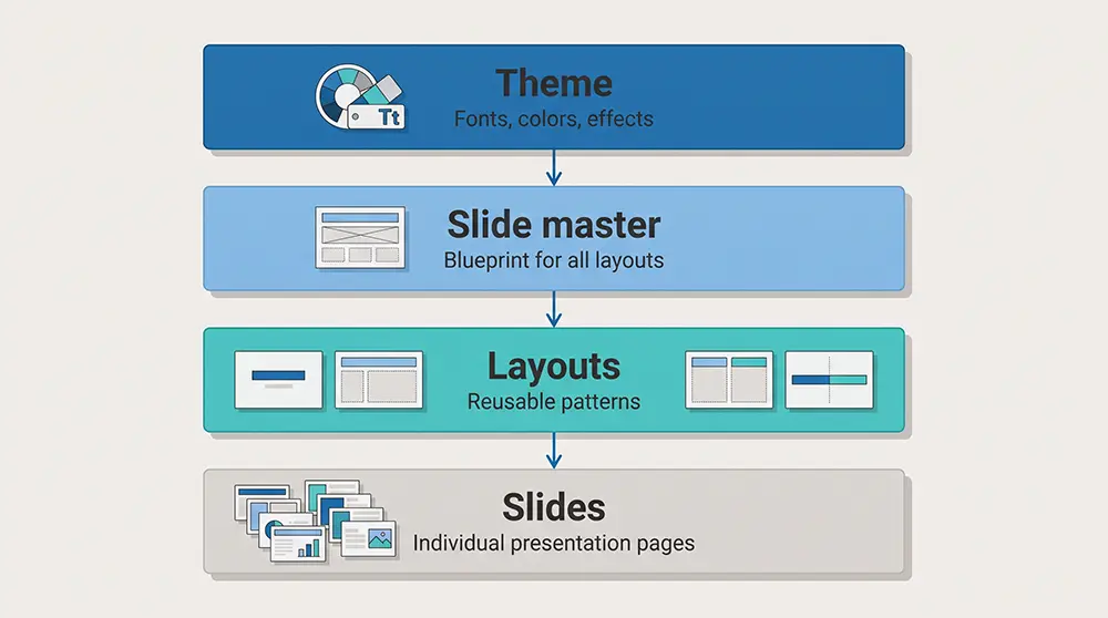
- Theme: sets brand fonts, colors, and effects. Tweak it once and every layer below updates [^1].
- Slide master: the blueprint. Add a background or default text here; each child layout inherits it.
- Layouts: cover, title-and-content, two-column, and other patterns. Each keeps its own arrangement while following the master’s style.
- Slides: the finished plates your audience sees. Content you place here can override the layers above, for better or worse.
If a deck misbehaves, identify the layer that owns the issue. Fix it there and the change flows downward automatically.
Define theme tokens before decorating layouts
Start with the ingredients, not the plating. In View → Slide Master, pick Fonts and Colors first:
- A PowerPoint theme packs 12 color slots: 4 text/background shades, 6 accent colors, and 2 hyperlink colors[^2].
- One heading font and one body font act as the default for every new text box, chart label, and SmartArt shape.
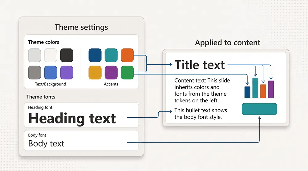
Select typefaces that match your brand and lock a balanced palette into those slots. If “Arial” lurks in any slot, every new text box will default to it, regardless of the styles on the master.
Test the system right away. Add a blank title-and-content slide, insert a column chart, and drop in a SmartArt list. If any font or bar color looks wrong, adjust the theme now; fixing it later means chasing overrides across dozens of layouts.
Create layouts around recurring content patterns
Start with the slides your team actually uses. Open a few recent decks and list the repeat beats: cover, section divider, title-plus-content, two-column comparison, and maybe an image-led quote. Those five or six patterns cover the real storytelling needs; everything else is clutter.
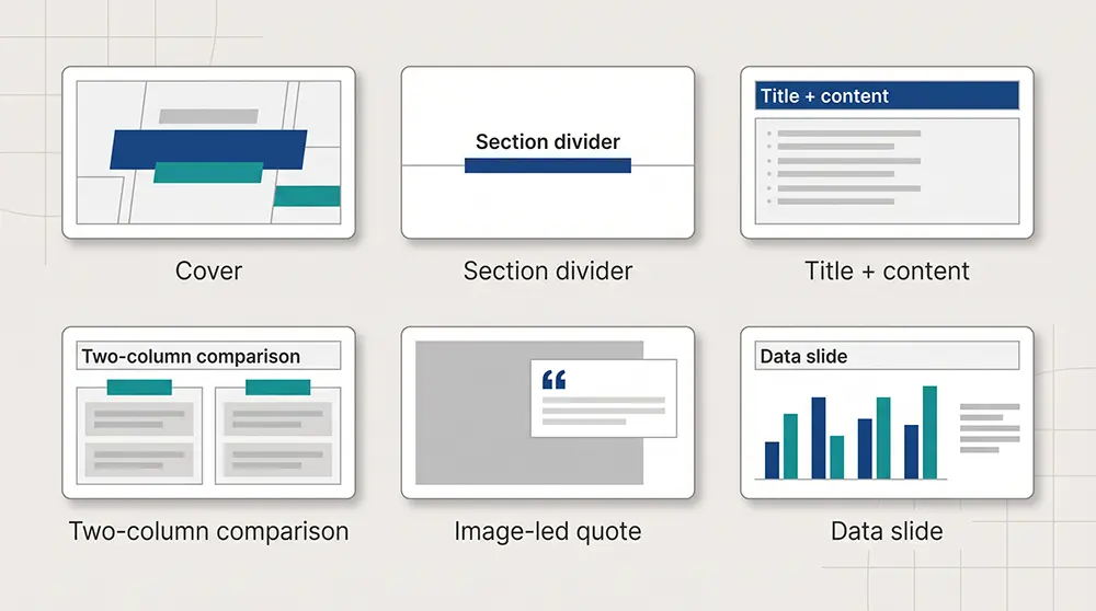
Industry pros suggest keeping a template between 8 and 15 layouts, so users stay focused and file sizes remain lean, according to a Slidor analysis.
Fewer options speed up slide selection, lower the risk of choosing the wrong layout, and let the deck travel smoothly through email, Teams, or SharePoint.
Need a fresh pattern, such as a testimonial with a head shot? Duplicate the closest existing layout, tweak it, and rename it clearly (for example, “Customer proof”). This keeps the grid, guides, and theme tokens intact, plus the built-in title placeholder that helps accessibility checks.
Treat your layout gallery like a capsule wardrobe: versatile pieces that mix, match, and stay timeless without the clutter.
Use placeholders, not decorative text boxes
Placeholders are more than empty frames: they act as coded hooks that tell PowerPoint, “This is the slide title” or “This box expects an image.” Because the app recognizes that role, it applies theme fonts, maintains reading order, and lets users swap content without breaking your grid[^4].
Add a plain text box and those safety nets vanish. A teammate can drag it off grid, restyle it in Comic Sans, or hide it behind a photo. Screen readers also miss unlabeled boxes, so accessibility suffers.
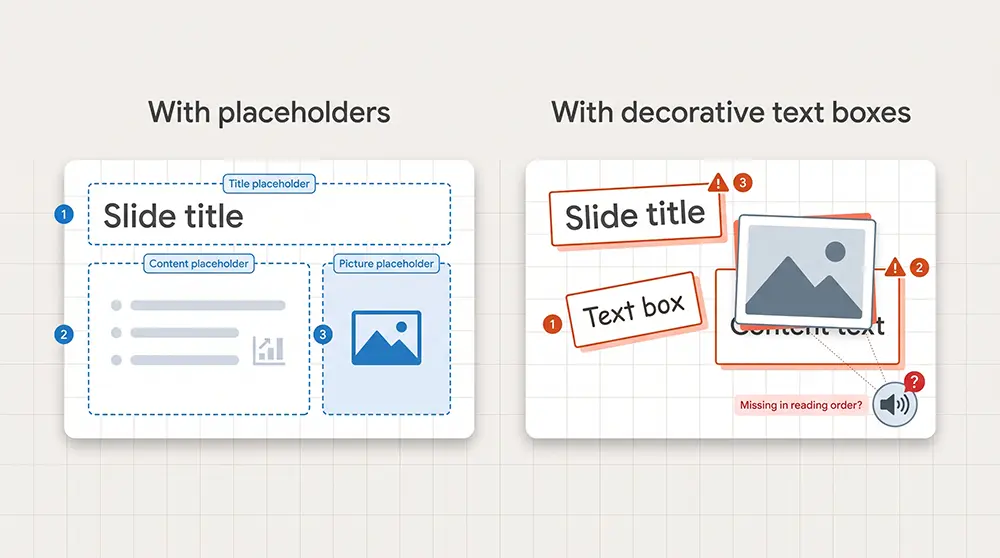
PowerPoint offers nine standard placeholder types in the Insert menu: content, text, picture, chart, table, SmartArt, media, online image, and cameo[^5]. Rely on the core set you need—usually Title, Content, Picture, Chart, and Table. When you coach non-designers, include a short prompt such as “Paste customer quote here” inside the placeholder. The prompt appears in Normal view and disappears as soon as real content arrives.
Before handing off the deck, run an accessibility sweep. Ensure every slide has a unique title and confirm that placeholders follow a top-to-bottom reading order. PowerPoint’s Reading Order pane and Accessibility Checker catch most issues, but disciplined use of placeholders prevents them from appearing.
Use the master as a soft lock
Objects you place on a master or layout become part of the slide backdrop in Normal view, so teammates can’t select or nudge them by accident. That setup is perfect for logos, navigation bars, or background shapes because they export cleanly to PDF, print, and the web app[^7].
The lock is flexible, not absolute. Anyone with edit rights can open View → Slide Master and move the pieces, or choose Design → Format Background → Hide background graphics on a single slide to hide them. Rely on the master to stop casual slips, not intentional redesign.
Rule of thumb: put universal, unchanging graphics on the master, and keep items that might change—such as numbers, dates, and client names—on the slide itself. You’ll protect the brand while giving presenters room to adapt.
Stress-test before handoff
Before you share the template, try to break it. Copy the busiest slide from yesterday’s client deck, paste it onto every new layout, and watch what happens:
- Does a five-line title crash into the logo?
- Does a wide chart spill past the grid?
- Does a dense bullet stack blow the baseline spacing?
Tweak guides, placeholders, or font sizes until those edge cases behave. Microsoft also suggests opening the file on Windows, Mac, and PowerPoint for the web to spot platform quirks before the team does[^9].
Need a quick second opinion? Plus AI for slide design runs directly inside PowerPoint, so you can open its Remix panel on that stress-test slide. One click re-lays the content onto the layout you just tuned, letting you instantly see whether long titles wrap, charts overrun, or rogue fonts slip in.
When the ugliest slides still look intentional, you can ship the template with confidence.
Diagnose by scope
When a slide misbehaves, resist the urge to mash Reset. First, pinpoint where the problem lives:
- Whole deck off? A rogue font, bullet style, or color shift on every slide often points to the theme or parent master. Fix it there and the cure flows downward.
- One layout off? If only a family of slides looks wrong, open View → Slide Master, select that layout, and check for an edited placeholder or mismatched font.
- Single slide off? The culprit is usually a local override—direct formatting, an unassigned text box, or the wrong layout. Re-apply the intended layout (Home → Layout), then decide whether Reset cleans up the leftovers.
- Pasted slides misbehaving? They may carry hidden masters. Click the Paste Options icon and choose Use Destination Theme to make them conform, or Keep Source Formatting if they need their own look. Microsoft confirms these choices determine whether incoming slides adopt or retain a theme[^10].
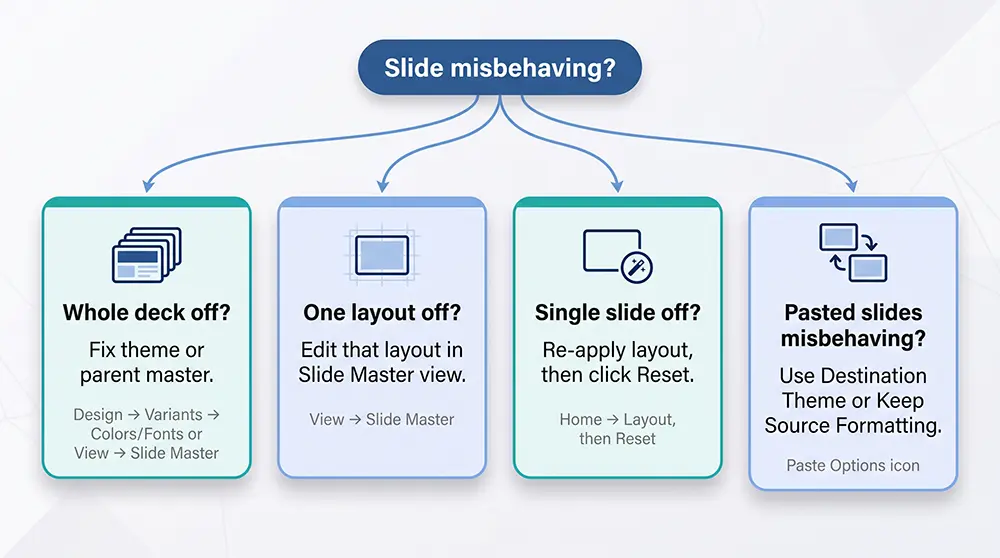
Diagnose first, reset second; your sanity and brand will thank you.
Follow a clean repair sequence
After you spot which layer is broken, fix it with surgical moves, not random clicks.
- Duplicate the problem slide for reference.
- On the copy, choose Home → Layout and re-select the intended layout. A wrong layout causes most issues.
- Still messy? Click Reset. PowerPoint repositions placeholders and reapplies theme styling while leaving your text and images intact[^11].
- If chaos lingers, create a fresh slide from the correct layout. Paste text as plain text, reinsert visuals, and delete the rogue original; the process takes about two minutes and beats hunting invisible overrides.
- Chronic cases—imported slides with mystery masters—need quarantine. Copy the source master into a sandbox file, clean it there, then paste the sanitized slides back. Five minutes now saves hours of template bloat later.
Respect what Reset takes and what it leaves
Reset feels like a magic broom, but it sweeps only items PowerPoint recognizes as placeholders. Click the button and every placeholder snaps to its scripted spot; theme fonts, colors, and bullet styles revert to default[^12].
What Reset ignores:
- Free-floating text boxes
- Pasted screenshots
- Decorative shapes or icons
If those items clash with the template, move or restyle them by hand. Treat Reset as a targeted remedy, not a panic button. Duplicate first, reset second, review third. The sequence safeguards important edits while erasing accidents.
Where AI assistance fits without bending the rules
Some slides are so overloaded with overrides that fixing them takes longer than rebuilding. In those moments, starting fresh is faster.
In-app helpers such as Plus AI handle the rebuild for you. Drop the unruly slide into its Remix panel, choose the layout you perfected, and the tool recreates the content with native placeholders, theme fonts, and proper reading order inside PowerPoint or Google Slides[^13]. Your design system stays intact while the AI does the heavy lifting.
Plus AI Slide Design Tool Homepage Screenshot
Have a 20-page PDF full of marketing copy? Send it to Plus AI, map each section to your layouts, and spot-check the output. Because the master and theme stay untouched, the new deck already passes brand and accessibility checks.
AI is a shortcut, not a substitute for judgment. Let the robot move boxes so you can focus on story and strategy.
Default to one master
PowerPoint lets you stack masters like pancakes, but restraint wins. Start with one master that carries your shared fonts, colors, and grid. Under that roof, add the light, dark, divider, and data layouts your team actually uses; BrightCarbon notes this setup covers “nearly all” real-world scenarios[^14].
Create a second master only when you hit a genuine wall: a separate event brand, a partner logo that needs its own color system, or an acquisition that keeps its visual identity. Even then, ask whether a simple layout tweak could solve the problem without spawning another parent.
Why stay lean? According to presentation-optimization firm Deckary, every extra master can add 2 to 20 MB of hidden bloat when unused layouts and background images pile up.
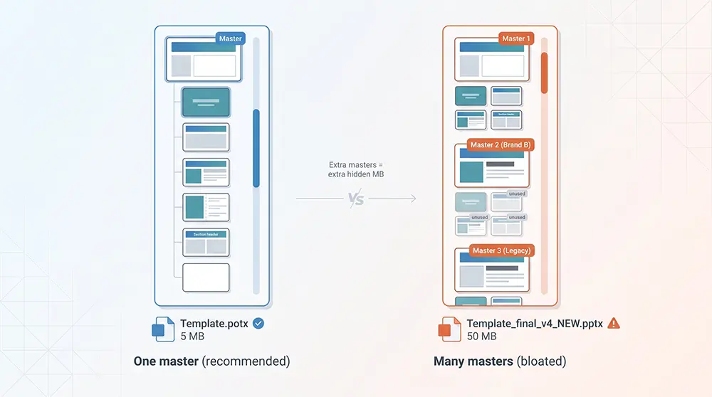
It also raises the risk of mystery fonts or half-baked themes when the deck travels between laptops. Future you will thank present you.
Import deliberately
Copying slides between decks quickly bloats a template.
When you need to reuse content, open both files. In the source deck, right-click the master you want and choose Copy. Switch to the destination deck, right-click in Slide Master view, and select Paste[^15]. Each imported slide now maps to its original layouts instead of spawning half-finished duplicates.
If you only need a few slides, choose your option up front:
- Use Destination Theme — adopts local fonts and colors.
- Keep Source Formatting — preserves the donor’s look and parks its master at the bottom of your pane.
Test in a throwaway copy. Paste, close, reopen, and scroll. If the deck shows 25+ unused masters (PowerPoint’s cleanup prompt), undo and rethink. A five-minute sandbox test beats hours of post-mortem cleanup.
Remove bloat before handoff
Even a tidy deck can collect barnacles. Each time a teammate pastes a slide with its own master, PowerPoint parks that foreign parent at the bottom of the pane. After weeks of edits, the scroll bar grows far too long.
Clean house before you publish the template:
- In View → Slide Master, delete any layout with a blank thumbnail. PowerPoint marks these as unused[^16].
- Check that no live slide shows “Layout missing.” If one does, undo and investigate.
- When the master list holds fewer than 25 unused parents (the point where PowerPoint stops nagging you to clean up), save the file as a .potx template.
- Open the template on Windows, Mac, and PowerPoint for the web. Paste a slide from last quarter’s messy deck; if the master pane stays short and the file loads quickly, you’re ready to ship.
One lean template beats seven files named “final_v4_NEW.”
Quick comparison: which workflow solves your actual problem?
Not every formatting headache needs a full Slide Master overhaul. Sometimes you just have to build a deck from a Word doc, rescue a single agenda slide, or keep ten thousand employees on one brand. Use this cheat sheet to pick the fastest lane.
| Immediate need | Best starting tool | Key advantage |
|---|---|---|
| Build a bespoke template with pixel-level control | Native Slide Master | Own every font, color, placeholder, then save as a .potx file—no extra software. |
| Turn documents into decks or reformat existing slides in familiar apps | Plus AI (Remix & PDF-to-Deck) | Converts a Word doc to native PowerPoint or Google Slides in under 60 seconds while honoring your master. |
| Generate new slides that stay within approved assets | Microsoft Copilot + Brand Kit | Tenant-wide “Strict” mode locks AI to sanctioned layouts, logos, and colors. |
| Distribute templates and reusable slides at scale | Template-governance platform | Central library, version control, user permissions, and usage analytics in one dashboard. |
| Ideate a highly stylized concept outside PowerPoint | Stand-alone AI presentation platform | Rapid first draft with bold visuals; export to PPTX for final polish. |
Conclusion
Pick the lane that matches your bottleneck—template design, content creation, slide repair, or enterprise governance—and you’ll move faster without sacrificing consistency.
PowerPoint Slide Master FAQ
What is the difference between a slide master and a slide layout?
The slide master is the parent style sheet; a layout is its child. Each layout holds a specific arrangement of placeholders, and a live slide inherits rules from its assigned layout unless you override them on the slide.
Why are my slide master changes not applying?
Two common culprits:
- Direct formatting. Someone hand-styled text or shapes on the slide itself.
- Wrong layout. The slide may be attached to a different layout than the one you edited. Re-apply the correct layout, then click Reset.
Can I edit the slide master in PowerPoint for the web?
As of October 2026, no. The web app can display custom masters, but structural edits still require the Windows or Mac desktop app[^19].
How many masters should a presentation contain?
One in almost every case. Add another only when the deck truly carries a separate design system, such as a partner brand with its own fonts and colors[^14].
Can a slide master completely lock my template?
No. Objects on the master are hidden in Normal view, but anyone with edit rights can open Slide Master view or choose Hide background graphics on a slide to turn them off.