

An effectively designed logo creates an image that consumers relate directly to a brand. It becomes an imprint of a company in the minds of its target customers. It is often the first impression they get of a brand, so it is essential that you make it the right one.
That is why logo design is such a critical step in developing a brand. That’s true for start-ups looking to make their mark and mainstream companies wanting to rebrand.
A logo is more than just a picture, though. It is a color palette, fonts, taglines, and style. It says something not just about the company it represents but the industry. It is a design that tells a story but also differentiates you from your competitors.
In other words, your logo is one of the most important choices you’ll make for your business. The good news is you don’t have to be a design expert to make that choice. You have options like trying a logo maker or hiring a freelance designer to create one for you.
When you use an online tool to design your logo it lays out the choices in front of you and allows you to pull them together in a cohesive manner. You choose a font, color palette, and style. They may have icons and graphics for you to choose from or allow you to upload your own. Once complete, you have several file options you can download to use for both print and digital media. On the other hand, if you hire someone that personally designs the logo for you based on your preferences and instructions, you can also end up with several options or have the flexibility of requesting some modifications to perfect it.
A practical place to start your logo journey is with an understanding of the different types of logos available.
What Makes for Good Logo Design?
A logo seems like a small part of a brand’s marketing strategy, but it is one of the biggest because it imprints on customers. Your logo must represent your brand in a distinctive way, but it must also be appealing and create a connection.
There are many elements that make up a logo, and the final design is the sum of all its parts. When considering your logo design, you must use these elements to communicate information about your brand.
Some of the individual components that can make up a logo include:
- Typeface
- Color Palette
- Graphics
- Style
A logo uses one or more of these elements to tell the story of the brand. Of the four pieces that can make up a logo, style or type is the one that can be the least understood.
What Are the Various Types of Logos?
When it comes to logos, type means the design style reflected in the graphic. There are some familiar logo types to choose from, and the better you understand them, the easier it will be to pick the right one for your brand.
Combination Mark
A combination mark logo uses both a visual item and a word to create a graphic image. These are some of the most common logos out there because they are the most versatile. For example, Nike’s logo is a curved checkmark with the word Nike over it.
Once Nike became associated with that logo, they were able to change it up in many ways and still have it represent the brand. For example, just the checkmark instantly says Nike when you see it. So if you see that checkmark on a pair of sneakers from a distance, you automatically know they are Nike shoes.
Wordmark
A wordmark logo puts the focus on the brand name in a stylized font. ToysRUs is the perfect example of a wordmark logo. It is made up of the brand name, but because of the design element, it is more of a picture than text.
Lettermark
Like a wordmark design, the lettermark logo represents the brand name but in an abbreviated fashion. For instance, BBC’s logo is three dark blocks with letters cut out of them. Right away, you know this is the logo for the British Broadcasting Corporation. You might not recognize them by their full name, but you know what they do.
Monogram
This style is similar to Lettermark, with one clear difference. The monogram style interlaces the initials of the brand to create a graphic symbol. The French fashion house built by Coco Chanel uses a monogram logo that is two intersecting C’s. The C’s are back to back, much like a link.
Letterform
Letterform logos focus on the first letter of the brand name as a graphic representation. What most people know as the Golden Arches is really just the letter M for Mcdonald’s. Another example of a letterform is the innovative T shape that makes up the Tesla brand logo.
Pictorial or Symbol
As the name suggests, this logo represents the brand as a symbol, often without any letters. The most famous example of a pictorial logo is an Apple with a bite taken out of it. Apples have little to do with computer technology, but when you see the symbol of an apple with a bite taken out, you automatically think of Apple computers.
Abstract
While a symbolic logo represents the brand with a visual that relates to it in some way, an abstract logo makes less of a connection. The Apple with a bite out of it is clearly a response to the brand name. The same can be said of a blue bird tweeting.
Abstract logos represent the brand but in a less cohesive manner. For example, the Olympic logo has different colored circles connected. That doesn’t have anything to do with the word Olympics or the brand, yet it is still one of the most recognized logos in the world. An abstract logo is a connection of shapes that have come to represent the brand.
Mascot
Mascot logos use a figure as part of the design. It can be realistic, like Colonel Sanders for KFC, or more abstract, such as a Martian icon cut into an orange circle for Reddit. Mascot logos are often fun but can be somewhat limiting. They are an effective choice if your brand is built around a personality like Wendy’s, for example.
Emblem
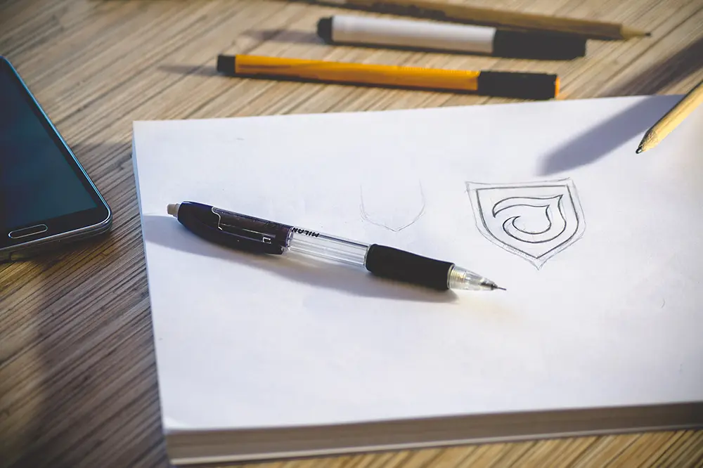
Emblem logos use a contained design to represent the brand. The container might be simple, like a circle, or more complex, like a shield. Probably the best example of an emblem design is Starbucks. The woman wearing a crown is encased in a circle.
Letters Inside Shapes
Like an emblem, this logotype encases the visual inside a shape. The image is a word or words, though, often the brand name. Ford encases its name inside a blue oval to create its company logo.
Lego is another effective example of this style. The word Lego is encased in first a yellow outline of the name and then again in a red square. The combination creates its visual logo.
Negative Space
A negative space logo carves out the design in an encased shape. For instance, the Girl’s Scout’s have a negative space logo. It is a green symbol with girls’ faces cut out of it. Many of the logotypes use negative space to create their effect. This design can be subtle or very distinctive.
Dynamic
A dynamic logo uses several styles to make it stand out. It may change color and shape, for example. MTV has a dynamic logo. It uses the first letter of their name like a letterform and encases words in a shape. TV is encased in a large M. The words “Music Television” sit under the M, and the logo changes color four times. It is also a combination logo because you can drop the Music Television and still recognize the brand it represents.
3D
A 3D logo seems to pop off the page when you see it. XBox has a 3D logo. There is an X cut into a 3D sphere. The graphic uses shading and doubling shapes to create a dynamic perspective that lifts the image off the flat surface.
How to Choose Your Logo Style?
There is no hard and fast rule that says you should choose one logo style over another. It is a matter of picking a logo that properly represents your brand.
In general, the simpler, the better, is a basic tip for logo design. You want the graphic to be easy to understand and associate with your brand. Your market matters, too, though. A more complex logo might make sense if your industry is known for its vitality or luxury.
The only thing that every logo must have is a sense of uniqueness. If your logo looks like your competitors, they may get your business. Make it reflect your brand’s personality and style and make it memorable.