

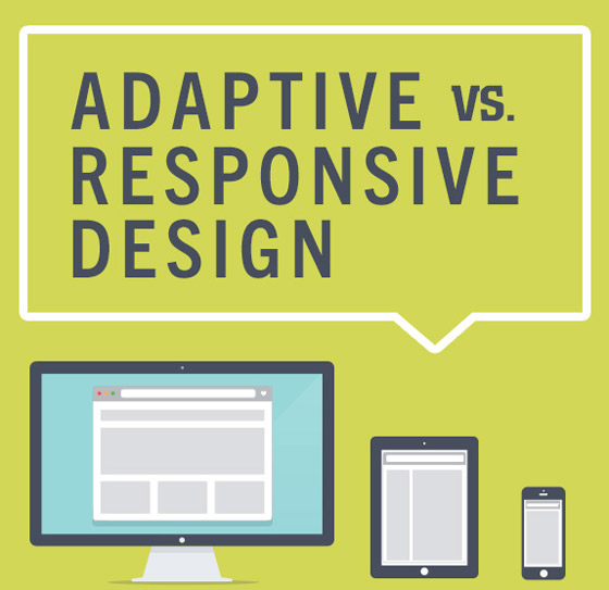
One of the most popular topics in web design since last year is the discussion around using responsive web design versus adaptive web design. The primary issue between these two approaches has to do with their differences in how they display your website and make it accessible over different devices such as the traditional desktop computer and the slew of increasingly popular mobile devices.
While this is actually an old debate in the field of design, the growing significance of mobile shopping in the future makes this a timely subject for online retailers whether they are just about to start their website or they are still undecided which approach to take for their existing website.
Adaptive Web Design (AWD)
Who best to describe Adaptive Web Design than the man who coined the term and wrote a book on it – web veteran Aaron Gustafson. According to Gustafson in his Easy Designs blog, adaptive web design is all about making an interface whose form and function adapts to the capabilities of the user. He also noted that AWD is just another way to refer to progressive enhancement, which Wikipedia defines as a web design strategy that is centered on making a website accessible on any web browser. In other words, its ultimate goal is to create a great user experience no matter what browser or device you use.
How does adaptive web design work? AWD uses several predefined static website layouts, each of which has been created for different screen sizes (for mobile phones, tablets, and desktops). When a customer visits your online store, it will display a particular layout with the corresponding style sheets depending on the screen size of the user’s device that was detected. In AWD, the web server does the device detection and loading of the proper style sheet based on the attributes and capabilities of the device.
Responsive Web Design (RWD)
Web designer and developer Ethan Marcotte, the originator of the term Responsive Web Design, describes it in the blog A List Apart as a technique to design the best viewing experience for various mobile devices using more flexible methods such as the use of media queries, conditional style sheets and fluid grids to create a flexible layout to suit any size of screen. In other words, a responsive website can alter its layout to match the user’s mobile device to provide the best viewing experience.
How does responsive web design work? In RWD, a web page is sent to the browser of the user’s device and the browser does the work in modifying how the page will appear relevant to its screen size. A responsive web design is able to change the composition of a web page fluidly by resizing and reordering elements on the browser’s screen depending on its dimensions.
A Comparison Between AWD and RWD
As mentioned above, both adaptive and responsive web design will allow your website to be viewed in different screen sizes on various mobile devices. Both approaches share the same goal that is to give website visitors the most optimal user experience. Their differences lie in how they achieve this goal.
If you look back at how each design approach works, you will see that an adaptive website uses predefined layouts and chooses the most suitable layout to display that will fit the user’s device whereas a responsive website uses a flexible layout that changes according to browser window size. Responsive web design focuses more on the layout of a website (including images, text styles, fonts and color) while adaptive web design can also enhance functionality for site users since it looks at the device’s capabilities so it can load a page that is optimized to match the device’s screen dimensions and also optimized to integrate other features the device has such as high resolution display or touch screen features.
Which is Better – AWD or RWD?
Both web design strategies have their good points and bad point, so one is not necessarily better than the other is. The proper question would be which approach is better for your website? Considering your ecommerce website design strategy, you need to determine which of the two will work.
With responsive web design, you can provide an optimal user experience no matter what device your website is viewed in and you only need to optimize a single HTML file for various environments. However, as explained in webdesign.org, the use of fluid images in this approach mean your site images are scaled on a percentage basis, you will be giving up some control as to how everything on your website will look. But the use of media queries presents a range of layout possibilities.
If you choose a responsive ecommerce website design like those offered by prominent sites like Shopify, it’s important that you are aware of the restrictions of designing for mobile computing and have a strategy in place for this. Generally, responsive website design is more suitable if you have an existing website and your goal is to make it work well on both traditional desktops and mobile devices. It is most suited for an informational website.
On the other hand, if your website is getting plenty of mobile traffic and you would like to give the best browsing experience mainly to your mobile users, then an adaptive ecommerce website design is ideal. Using an adaptive approach, you can optimize your web design to utilize the special features that are specific to the device being used for an enhanced user experience.
For businesses working with a smaller budget, the adaptive approach may be more suitable since you only need to build a few layouts to suit basically three types of screen sizes, for mobile phones, tablets, and desktop computers versus developing one layout that need to be optimized for all mobile devices. Also, since responsive designs scale elements, it is better to go for an adaptive web design if your website is heavy on images that will not display properly when scaled.
Again, both adaptive and response web designs are meant to offer a user-friendly browsing experience on both desktop and mobile devices, although there would be slight differences in terms of functionality. Ecommerce software offers you choices between the two. Choosing the right approach for your website should be based on your available resources and the type and amount of traffic your ecommerce site gets.