

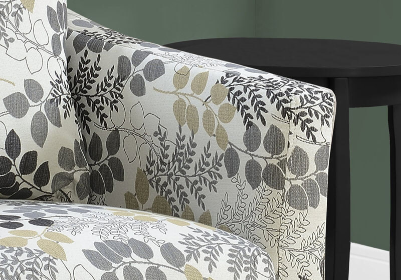
Nothing conveys coziness and calm quite like upholstery on your bedroom furniture. The soft visual effect from the layered fabrics – from your bed to the window treatments – helps create your perfect dreamscape. When it comes to mixing and matching fabrics, the color combinations and patterns are truly endless. But this breadth of choice is also why many people don’t know where to start.
Luckily, there are a few simple rules of thumb to flawlessly pair your favorite hues together, creating a bedroom color palette that’s interior designer-approved!
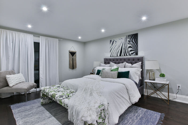
MAKE IT MAXIMALIST
If color is your love language, then who’s to say you can’t have it all? The beauty of maximalism is in its layered, more-is-more approach to decorating. Upholstering with bold pops of color and varied material creates an engaging, personal, lived-in vibe that is always a conversation-starter. Maximalism continues to pick up steam in the interior design community as a reaction to the pared-down minimalist interiors that have monopolized the scene for the past decade. And if maximalism speaks to you, a conversational and bright Scalamandré fabric – from the leaping cheetahs to the iconic zebras – may be just what you’re looking for.
EMBRACE EARTH TONES
Speaking of revivals, another bedroom trend is the nature-inspired aesthetic of the 1970s. This is perfect for the person who gravitates more towards mid-century minimalism, with an appreciation of organic, earthy imperfection. Think: mossy velvets, neutral linens, and saddle leather. If you’re looking to bring the outside in, opt for natural textures, incorporate live plants, and aim for a combination of upholstered and wooden bedroom furniture, and choose earth tones such as browns and greens.
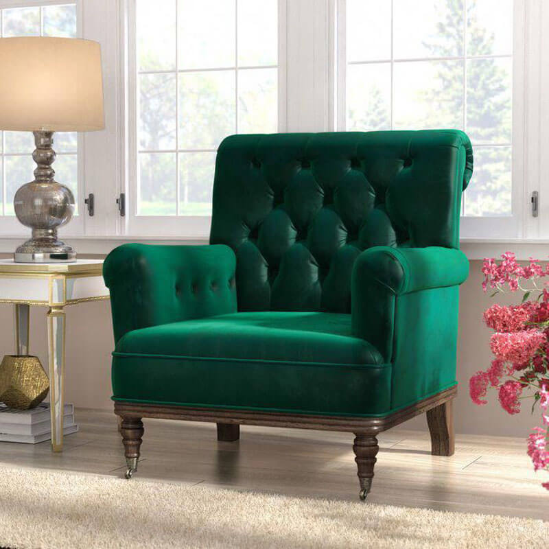
CREATE A JEWEL BOX
To create a glam-inspired sanctuary, opt for gemstone-inspired hues, such as sapphire blues, amethyst purples, citrine yellows and emerald greens. These colors, found in nature, create a cozy, enveloped vibe with a touch of rich femininity. If you’re looking to design a space that’s bold and deep, don’t hesitate to dress the room top-to-bottom in jewel colors. To avoid a space that’s too overwhelming, add softness with a few neutral design elements, such as a beige rug. If you’re just keen to experiment, pick one primary upholstery piece – such as the headboard or a pair of x-benches at the foot of your bed, and dress them in a deep jewel tone that immediately catches the eye as the room’s glamourous focal point. Finish your space with metal accents – such as bronze or metallic – to complement the upholstery and round out your glamourous bedroom.
STICK WITH THE PRIMARIES
As the foundation of all other colors, red, blue and yellow have a major impact for their reputation as straightforward and bold. When decorating your space with a primary color palette, try to stick with only two of the hues as the focal point. For instance, if you opted for blues and reds as your primary color scheme, opt for a pattern that features those hues most prominently, perhaps with touches of yellow as an accent color.
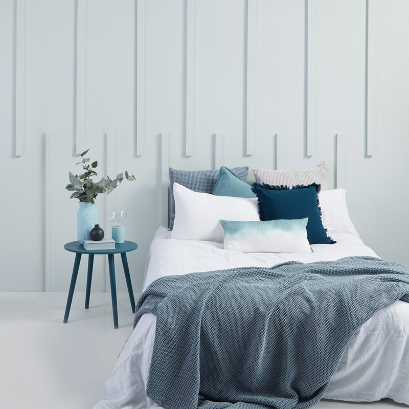
GO TONAL
If you’re looking to create a relaxing, serene atmosphere in your bedroom, tonal decorating is having a major moment. Tonal is another way of saying monochromatic – in other words, choosing one main color (yes, any color!) and decorating the entire room in various tints and tones of that color – from the paint colors to the upholstery. Nothing particularly pops – rather, everything intentionally recedes, creating that calming and balanced effect that’s so perfect for the bedroom. The key is to visual interest will be to play with various textures, which will add contrast despite all falling in the same color family.
COOL IT OFF
As a rule of thumb, the color wheel is divided into cool and warm colors – the cool colors refer to the soothing hues such as blue, green and violet. They’re referred to as ‘cool colors’ because they tend to have a soothing, calming effect, almost one that recedes into a space. That’s why cool toned colors in particular have a special place in the bedroom, adding a serene effect that is so crucial to creating your bedroom sanctuary. If you’re opting for a cool color palette, you can go tonal (as mentioned above) with various cool shades of one color family, or take a look directly across the color wheel for pops of warmer hues that create a nice balance to your cooled-down centerpieces.
PRETTY PASTELS
Decorating the bedroom with a joyful, uplifting color palette is having a major moment – specifically, pastels. While millennial pink has forever cemented a spot in this interior design era, we’re now starting to see a resurgence in mints, pastel blues and yellows. The key is to use these colors in a sophisticated way, without feeling too juvenile or Easter-eggy. The trick to making your space feel elevated is by not going for pastels that are too saturated, and instead keeping the colors a little dustier.
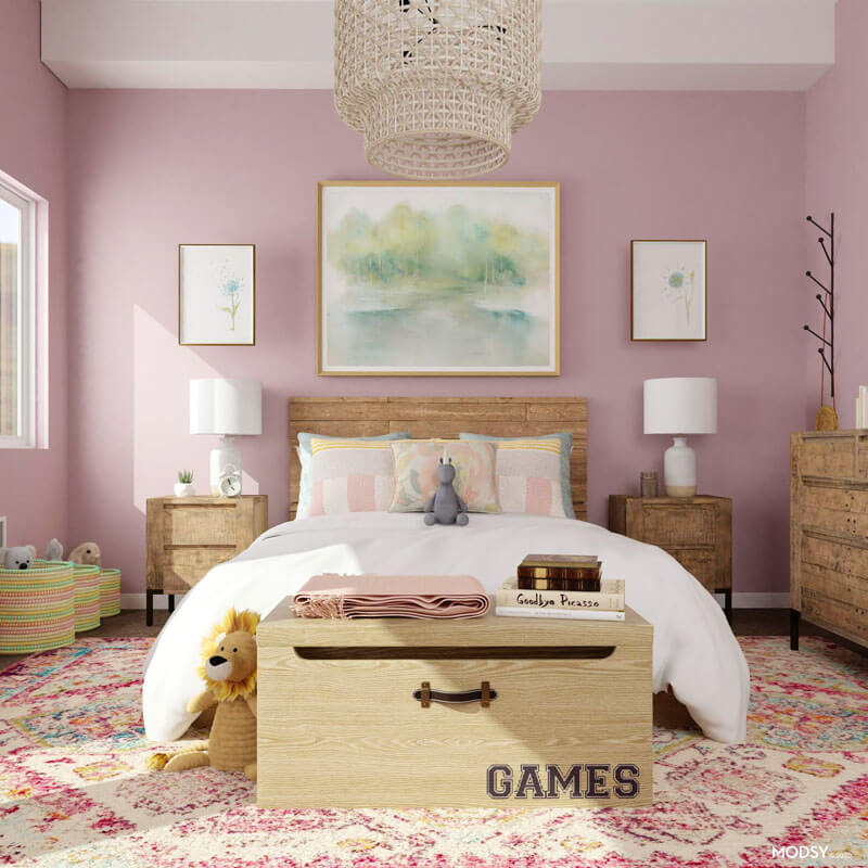
How you incorporate pastels into your space totally depends on your comfort level with color. For someone who wants a really uplifting space, commit to a dusty pastel wall color and layer in others throughout the room on your furniture upholstery – whether that’s your bed frame of other bedroom décor. But if you’re just dabbling with pastels, start with a color pop approach: go for a neutral backdrop (white or off-white walls) and bring in the pastels through colorful accents, such as throw pillows.