

Having a strong logo is critical for any business. An effective and attention-grabbing logo helps to build your brand and promote your business, when used everywhere from letterhead and your website to marketing materials like flyers and promotional stickers.
When it comes to creating the perfect logo for your brand, one of the most critical elements is colour. Using the right colours will not only create a beautiful logo, but one which will convey your brand values and personality.
Why are colours important
Your brand elements such as your logo, and the colours that you use in them, can make a big difference to attracting customers and making sales. 85% of consumers say colour is the most important factor when choosing a branded product.

Colours have a huge impact because they speak to consumers’ emotions. Emotions are powerful drivers, and great influence decision making, including when it comes to whether or not to buy a product or service. Faber Birren outlined how different colours can trigger certain emotions in his book Color Psychology and Color Theory.
You can use this to your brand’s advantage to elicit emotions that will encourage customers to buy your product. Additionally, you can use certain colours to tell your customers what you stand for just be looking at your logo and your brand colours. If you need help to design your logo, you can always find professional design agency like logo design Gold Coast
Know your Brand
Before you can choose the right colours for your brand logo, you need to identify your brand’s key traits and values, in order to find the right colours that fit these traits and values. For example, if your brand is about energy and dynamism, red may be the right choice for you. On the other hand, brands in the financial services and pharmaceutical industries overwhelmingly have blue logos as these convey trustworthiness.
Start by identifying your brands key values and the aspects of your brand personality that you want to convey. Also think about your brand’s goals: what do you want to achieve through your marketing strategy and who do you want to reach? Creating a mood board that tries out different colours and images can also help you to work out the best colours that represent your brand.

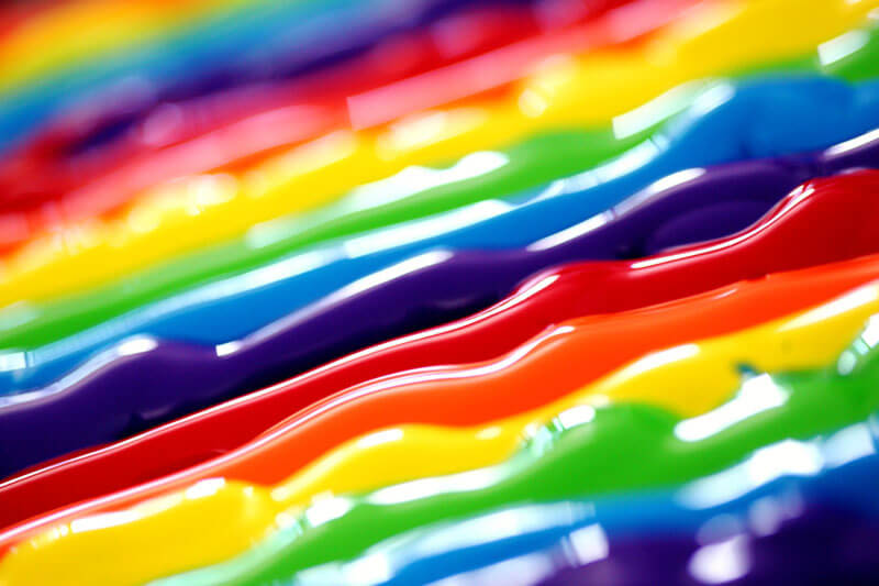
What do Different Colours Mean?
As mentioned, various colours solicit different emotions in consumers and therefore convey distinct values.
In terms of branding, here are the feelings and values commonly associated with colours:
- Red: excitement and passion
- Orange: energy and activity
- Yellow: happiness and joy
- Green: nature and healing
- Blue: trustworthiness and innovation
- Purple: individuality and creativity
- Pink: love and femininity
- Black: luxury and sophistication
In choosing your brand colours, think about the brand values, audience, and message that you identified. However, it is not as simple as choosing the two or three colours that best represent your brand. You also need to look for colours that will work well together, which we will explore in the section below. You should also consider whether colours have certain cultural connotations which will vary depending on where your audience is based.
How to Choose a Colour Scheme
You not only need to choose the right colours that will represent your brand, but you need colours that will look great together and convey your brand’s message as a whole. There are no hard and fast rules, and these will depend greatly on your business and your brand. As a general rule, three key brand colours work best, though brands can have between one and four colours on their logos. Three colours is generally ideal, however, because this allows for a base colour, and accent colour and a neutral colour.
The base colour is your primary brand colour, the tone that best reflects your brand’s personality and speaks to your dominant trait. The accent colour provides a complimentary tone that conveys another personality trait and also visual relief. The neutral colour can be used for the background, and is usually a neutral colour such as grey, white, beige or black.
To find a complimentary colour that works well with your primary colour, the best approach is to use a colour wheel. Complimentary colours lie across from one another on the colour wheel, such as yellow and purple, orange and blue, or red and green. Another approach is to choose three colours that form a triad: that is, a triangle shape on the colour wheel. A less conventional approach that can also be effective is to choose analogous colours. These are the colours next or close to each other on the colour wheel, like red and orange.
Following the rules and colour theory can be helpful in producing a powerful and effective logo. Having said that, don’t be afraid to experiment and try new things, especially if your brand is innovative and unconventional.