Sometimes, 3D effect can add depth to the picture and the words more outstanding. However, it doesn’t always work. I will list some design I found and share with my thought:
Cited From http://artek92.deviantart.com/art/3D-Typography-artek-92697024
A nice and cute 3D effect typo. But it seems hard to recognize what the typo for.
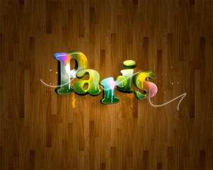
Nice work. Candy like color make the whole picture sweet and shining
Cited from http://joard.deviantart.com/art/Garamond-III-53288935
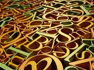
Golder color make the whole picture has sense of luxury. Personally though, it is more suitable for an background
Cited from http://www.morevision.ru/
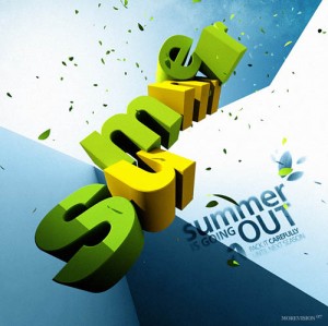
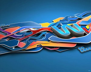
three cool and semi warm color make the summer a little bit cooler.
Cited from http://www.morevision.ru/
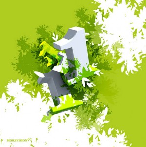
Number 1 blended with the trees… A nice design.
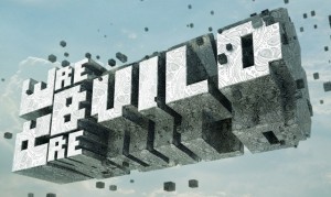
cited from http://gomedia.deviantart.com/art/Rebuild-69237017
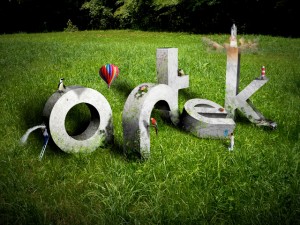
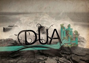
Personally like the texture on the words. the stone-like words feel like rocky. but the problem is, it is so hard to recognize what the words mean.
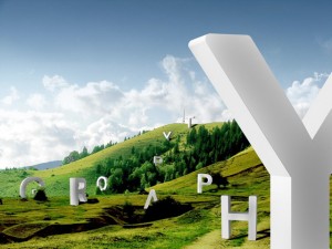
Cited From http://bloodyhippo.deviantart.com/art/Typography-on-a-Hill-93154976
Still a nice design, but just design. at least, I cannot know what those letters for.
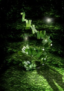
I have to say, I though that it was not a nice one. All green and dark color make everything blended. those letters are hard to stand out from the background
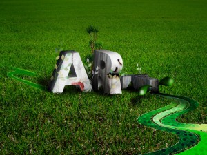
Cited From http://luuqas.deviantart.com/art/Art-line-87680251
Still grass with stone type 3d words. not bad, Personally, I don’t like the glass like path.
I am a liitle bit lost for this one. Just can say, that is not my style.
Cited from http://iunewind.com/2007/03/02/winter-process-v2/
I like the color and paper-cut style decoration
Cited from http://www.thenorik.com/
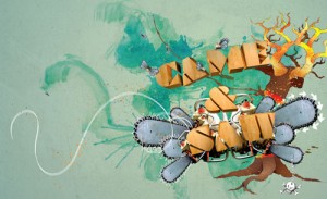
wooden like 3D typo. Maybe it is the font’s problem. I am not so with this one. and branch on the background also take attention away from the title.
