

Popular culture and fashion impact the web design world each year. Some years seem to move toward a minimalistic theme and soft colors. But as we move into 2021, we’re seeing more bold, bright color choices in web design color schemes.
The world generates a massive amount of data every day. There are about 33.9 million photos uploaded on Instagram, 100 billion emails sent and 2.7 million blog posts written daily. Today’s consumer is overwhelmed with content, advertising and noise.
If you want to stand out from the crowd, you need to stay on top of trends and try something a bit different. Add in bold colors as an accent, create a new background featuring several 2021 color schemes or go outside the norm and use a choice no one else seems to have discovered yet.
We’ve gathered the six best website colors choices working perfectly for the coming year. Use these as a springboard for inspiration in your own website designs! The key is understanding the personality of your brand and how colors impact the emotions of users. We’ve gathered six beautiful examples of color choices working perfectly for the coming year. Use these as a springboard for inspiration in your own website designs!
1. Soothing Teal
Benjamin Moore named Aegean Teal their 2021 color of the year. With a slightly faded hue, the greenish-blue color makes the perfect accent for any type of website. Teal has a sense of modern fun. It works well for many different kinds of industries.
Tech companies, online retailers and service industries may benefit from the impression of a modern, casual approach. The color wouldn’t work as well for industries such as finance or education.
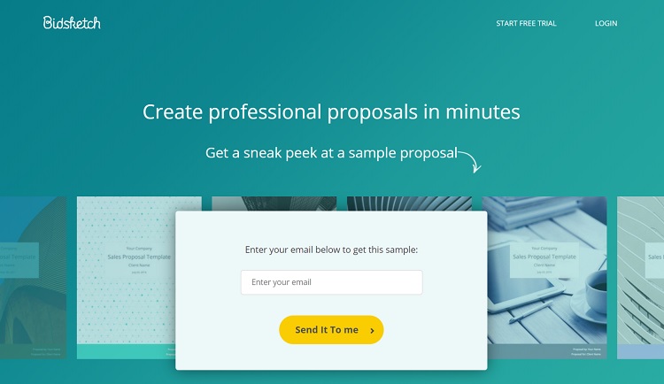
Bidsketch uses teal in their background at the top of their landing page. Then they pull in a lighter hue of the color as you scroll down the site. The bright pop of blue shows they are innovative, and their software allows you to be current for customers. It’s also eye-catching, since you don’t see many sites featuring such a pop of teal.
2. Complementary Blue and Orange
Another current trend is the use of complementary colors. Blue and orange sit across from each other on the color wheel. While they might not be colors you’d immediately think go together, when one is used as the primary color and the other as an accent, or both as accents, the effect is striking.
Blue is a soothing, reassuring color. It sends a message that you’re reliable and steadfast. Orange adds a dash of excitement. The two choices together have a subtle impact on site visitors, showing them you know your industry but are also open to innovations.
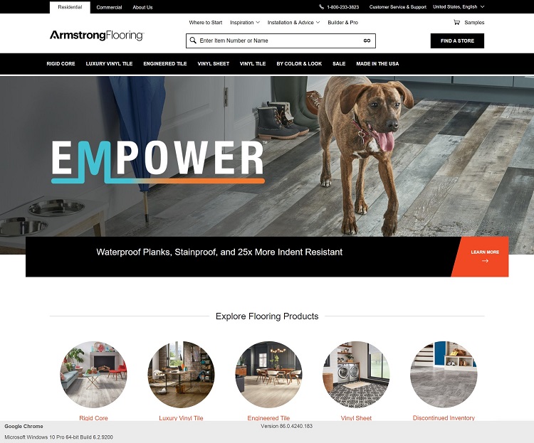
Armstrong Flooring uses complementary blue and orange in their logo. They only use it to accent some of the letters. They also reflect these colors in accents throughout the page. The overall impact is subtle yet sends a strong statement that they know floors and have the latest styles.
3. Retro Orange and Yellow
If you look to the fashion industry for some direction as to what is coming in 2021, retro colors seem to be making a comeback. Think 1950s or ‘60s diner hues. You might see a combination of pink and blue, mustard yellow with bright orange or soft greens.
Designers aren’t just choosing one vintage color as an accent, but rather combining several colors for a unique look. You can go with one color for the background and then add another for an accent.
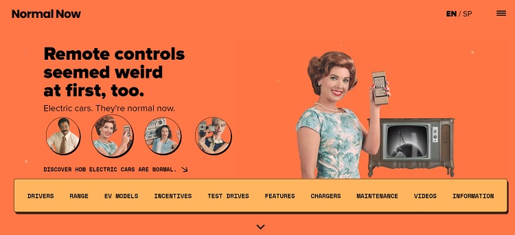
Normal Now uses the retro trend to their advantage by comparing things of the past with the innovations of electric vehicles. In addition to a bright orange background with a mustard yellow navigation bar, they also use retro photographs of women in dresses and styles from yesteryear.
The campaign features a variety of different car brands. The entire concept is fun and modern but still embraces car-buying traditions.
4. Dark Mode
In September 2019, Apple released dark mode with their operating systems. The idea behind the design change was to make screen reading less straining on the eyes. However, website designers around the world began embracing the concept, going to darker designs on their pages.
The trend isn’t going away anytime soon. Instead, we’re seeing more web designers embrace dark, stark looks.
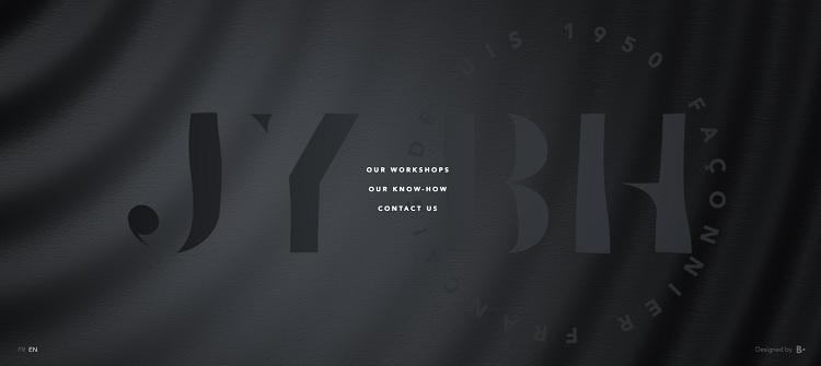
JY BH is a French clothing manufacturer. Their site uses black on black for a stark look. As you scroll over the logo, parts of it lighten to a gray, creating an animation that grabs attention. The use of dark colors creates a sense of stability and seriousness. The company makes high-end luxury clothing and the dark colors convey the style of the brand.
5. Deep Purple
A rich, regal purpose seems to be overtaking the internet. We’ve seen this color on Facebook pages and various brand designs. The hue also shows up in clothing lines, indicating a trending color for the coming year.
Purple pairs well with the teal mentioned above and looks equally striking against a dark or light background, depending on the mood you’d like to set.
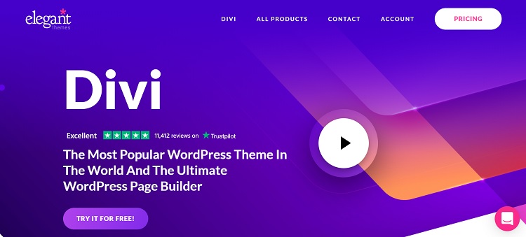
Divi is one of the most popular WordPress theme options because it is highly versatile and customizable. The theme is by Elegant Themes, and they’ve created a landing page with dark purples to show the cutting-edge nature of the option.
Note the combination of several shades of blue and purple gradients. They also add a small amount of pink and orange to add a bit more interest and draw the user’s eye to the right side of the screen for a video and live chat.
6. Dark Pink
Pantone’s colors of the year include raspberry pink, French blue and amethyst. All the colors mesh well together or could be used as an accent on any website. While you might traditionally think of pink as a feminine color, designers are breaking through those stereotypes and creating designs that are masculine yet with a dash of bright hues at the same time.
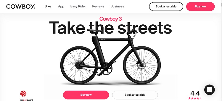
Cowboy Bikes are clearly not just for women. These rugged bikes attract both male and female buyers. The majority of the page is neutral black and white. However, they add a dash of modern color with a swash of raspberry in some of the letters, their review stars and their calls to action (CTAs).
The Best Color for Your Site
While it’s smart to pay attention to the popular colors of the year, the shades you choose should ultimately reflect your personality as a brand. Trends come and go, but your customers will hopefully stay around for years to come. Balance the use of new color combinations with the image your company already embodies. Don’t be afraid to try new things, but also don’t fear sticking with what you already know works.

Lexie is a digital nomad and graphic designer. If she’s not traveling to various parts of the country, you can find her at the local flea markets or hiking with her goldendoodle. Check out her design blog, Design Roast, and connect with her on Twitter @lexieludesigner.