

In online marketing, a landing page, sometimes known as a “lead capture page” or “single property page“, is a single web page that is created in response to a marketing promotion or an online advertisement. This type of pages is often linked to e-mail campaigns, social media and search engine marketing campaigns to enhance the effectiveness of the advertisements.
From the above description, we can tell that a landing page is where a visitor “lands” after they click on a link in the advertisement. Hence, the page usually displays a highly relevant copy that works as an extension of the advertisement or link. For instance, if the goal of the landing page is to obtain a lead, it will encourage the visitor to get into contact with the company. And if a sale is required, it will usually have a link which sends visitors to a shopping cart. In both cases, landing pages encourage visitors to act.
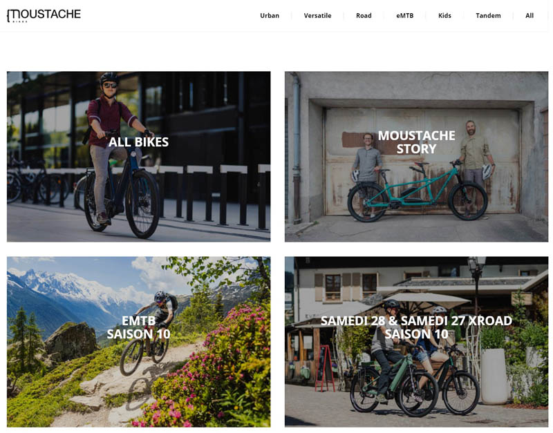
This characteristic makes it different from the other types of web pages – landing pages only have one goal – convert site visitors into sales or leads. To demonstrate, we will use a bike’s homepage as an example. From the image below, you can see the site’s homepage has many links and options for visitors to explore.
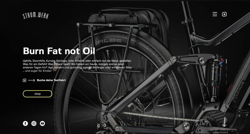
While its landing page is all about one bike and has only one – “shop” button.
By comparing the two pages above, you might come to the conclusion that you need to have fewer links on the landing page to increase conversation and make visitor stay focused. However, is that all we need to do for an effective landing page? What else should we pay attention to in order to avoid distraction? Are there any other guidelines we should follow to boast off-the-chart conversion rates?
If you are looking to create a landing page, you don’t need to worry about your technical skills or having a high budget. There are plenty of affordable, and even free, online tools tat can make things pretty simple. For example, you can use a landing page maker to create the landing page, and you don’t need any web design or coding knowledge to do so! However, before you design your landing page, there are several things you need to take into consideration. First, you must think about the goal of your landing page. What do we want our visitors to do upon reaching the page? Do we want them to buy something? To sign up for a service? Or download an eBook/reporter? These goals might sound different, but there are really two types:
Lead Generation Landing Pages
This type of page uses a form as their call to action. The purpose of the form is to collect visitor’s contact information like name, email etc. It should be noted, this type of form should be simple and straightforward. Moreover, it often offers something free, like a free sample, free trial, or discount code. These benefits will be the driver that make visitors fill out these forms.
Clickthrough Landing Pages
This type of page is not designed to capture information. Instead, it goes straight for sales or subscription. Hence, they usually have a simple button that sends the visitor to the checkout flow.
Now that you understand what a landing page is and how it is different from the other pages, let us look at some of the best landing pages to figure out what makes an effective landing page.
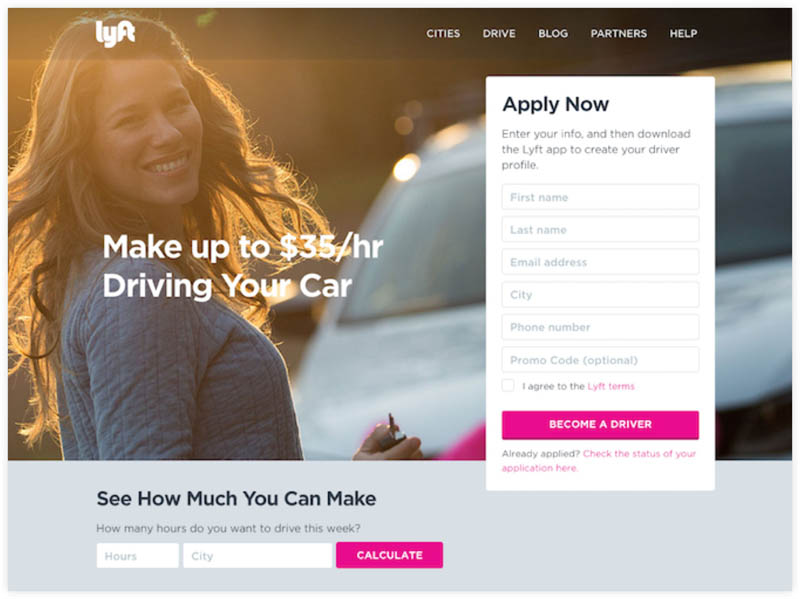
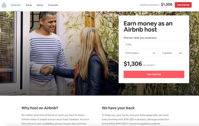
Take the “Lyft” landing page as example. The first thing you will notice is its strong heading that addresses the pain point & provides a solution. Then there is an easy-to-fill lead capturing form. To make it more persuasive, it also provides a calculator at the bottom for visitors to get a rough idea of their potential earning if they sign up. This is an effective approach that has been used widely. For instance, Airbnb also uses such methodology in their landing page design.
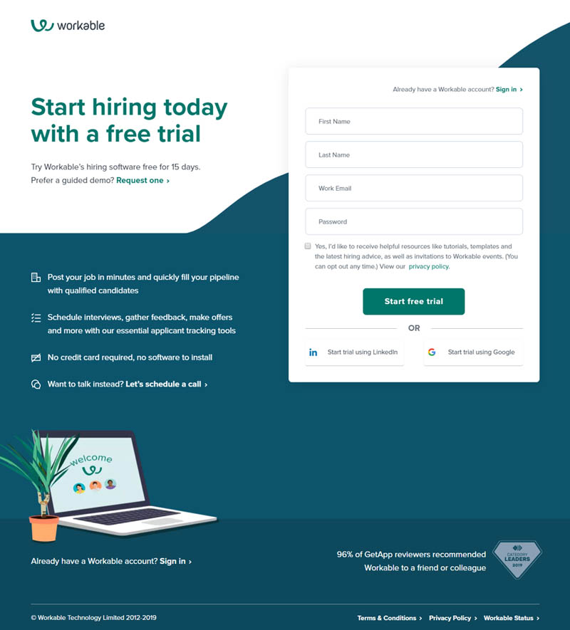
You might be thinking, not all services provide income. What should we do if our service requires payment? How can we get visitors sign up for it? Let’s use the landing page of workable.com as an example. Workable’s audiences are busy HR managers and recruiters. Hence, a simple and easy to fill sign-up form is important to get the visitor to start using the service right the way. Moreover, the majority of the copy on the page is to emphasize the benefits that users will get from using the platform.
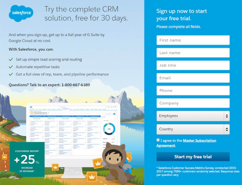
Salesforce’s landing page uses both approaches mentioned above. It does not only highlight its benefits, but also offers a free trail.
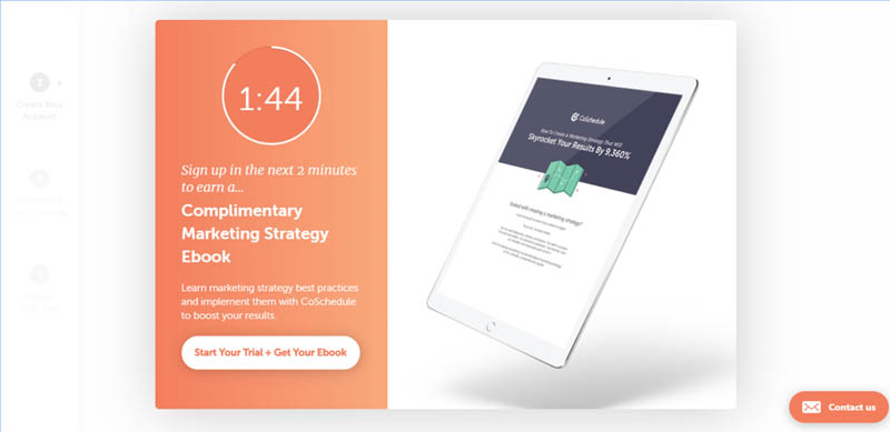
A Countdown is also a noteworthy element for landing pages. By including a time-limited offer, you imply a sense of urgency to the visitors. And it usually does a great job of encouraging those who are hesitant. However, you should use it sparingly. You do not want your visitor to see the offer every time when they visit the page.
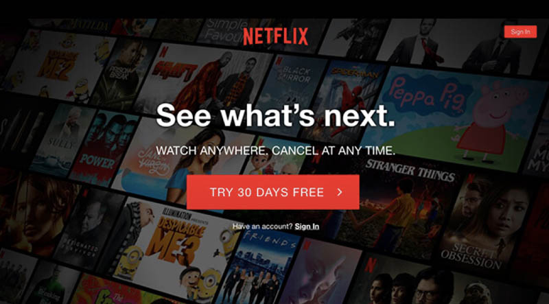
Besides for the page’s copy, the graphic design is also important. Netflix’s landing page is minimalistic and yet packs in a lot of information for the visitor. Its simple but compelling heading enforces the benefits. The well-designed and well-placed CTA button is hard to resist. And its background with all the popular shows and movies helps visitors visualize what they can get. However, different from the other examples above, Netflix’s opted to hide the form and just focus on making visitors click that “try” button. We all know it is hard to get a visitor make the first step. Hence, Netflix tried their best to make that first step as easy as possible.
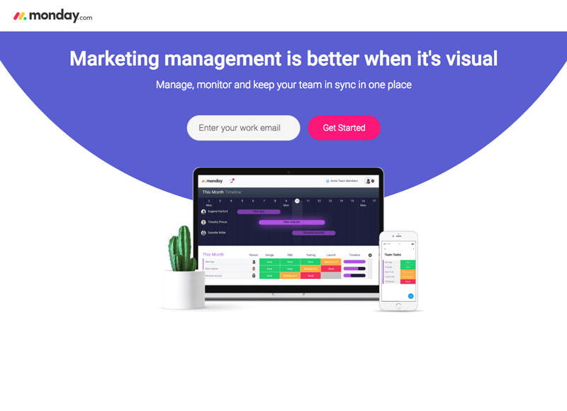
Monday.com is another great example for this topic. As a project management tool growing fast these days, one of its reasons for success is surely the appealing and convincing landing pages. Visitors will land on different pages according to the clickthrough link. For example, if the visitor clicks from an ad about marketing management, the marketing related landing page will be shown.
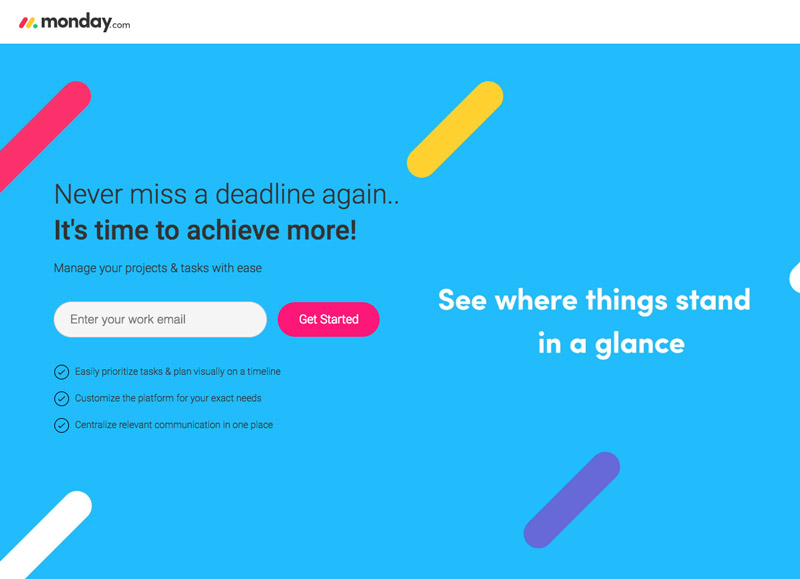
And if the visitor clicks through the ads for “catching the deadline”, then the page with deadline related copy is shown. The page matches the ads that visitor sees and gives the visitors what they want. Moreover, its super simple starter form is another highlight. Just one email address and visitors can start to try out the service. Why not?
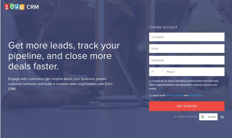
ZOHO’s landing page might not be the most attractive one, but it has a feature worth mentioning – “social network login”. Most people don’t like to create different accounts for different sites. It is hard to maintain. That’s why “social network” login is such a great idea- they can just login or subscribe to your service with the account that they use every day. The simpler it is to get visitor involved, the more effective your landing page will be.
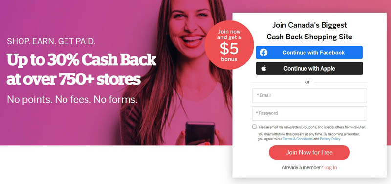
And ZOHO is not the only one that supports the social network login, Rakuten’s landing page is another example.
Hopefully you now have a better understanding of what a landing page is and what makes an effective landing page. Let us conclude what we learned and use them as guidelines for our next landing page design:
- Keep the copy to a minimum.
- Use language your audience can relate to.
- Be benefits-oriented and make them convincing.
- Use the right, relevant and visually attractive imagery.
- Make the CTA (call to action button) standout.
- Provide a time-limited offer when applicable.
- Employ social media sign-ins to simplify the steps.
Besides that, testimonials, interactive tutorials, and user ratings are commonly used elements on landing pages as well.
There is no perfect landing page, but we do have some well-established practices we can follow. Use the above landing page examples as benchmarks for your next design and employ some of guidelines mentioned above to convert hard-won traffic into revenue.