A pamphlet is a type of publication in which information is supplied and written in a persuasive manner. Efficient design and use of space play a crucial role in the appeal of a pamphlet. Designers often make the mistake of trying to use too many fonts and/or stick to a rigid format when using a pamphlet maker. Here are some common font errors that pamphlets tend to fall into:
Using Too Many Font Styles
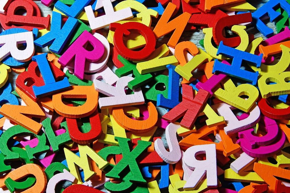
If there is one thing often taught in design school, it is to never use more than two font types per layout, however many different faces you can use in that space. Much like in a brochure design, space is precious in a pamphlet, and to alter the format for every new sentence would cause confusion. While it may seem to be innovative and eye-catching, using more than two font types will only distract from your content. There are those that would use a free pamphlet maker and cram up to five or six different styles of writing in an attempt to create an interesting layout, which, of course, does not succeed.

Source: adonyig/Pixabay
Using Too Many Font Colors
When using font styles in an online pamphlet maker, do not use more than three different types of color if you are aiming for subtlety. If it is a very bold pamphlet, where the message needs to be clear and foremost in the readers’ mind; then do as many as you want. There are so many pamphlets where the digital pamphlet maker uses too many colors and it is just a big mess of text and shades.
Using Non-Proportional Fonts Wrong
When designing anything, whether it be font or artwork, proportionality must be considered at all times. This means that if you are using a font in a pamphlet maker online that is not proportional, then the spacing should either be even or random. If it is not done correctly then it will look like blocks or squares were just put together to fit in the space provided. It takes only extra effort to do this part right and it helps with communication.
A frequent example of this are pamphlets where there are a lot of lines going in horizontal directions where there is a block of text using a non-proportional font and it looks like someone just scribbled on the paper. This mistake can be avoided by making the lines as evenly spaced as possible, or if this cannot be done then use neutral blocks to fill up that space.
For example, if you have several sentences using a non-proportional font with different sized letters and then you have a sentence in a proportional font, the difference will appear significant because of the clarity between these two different styles.
If you are using a non-proportional font for a body of text, it should be used either all throughout the pamphlet or not at all.
By mixing between proportional and non-proportional fonts, different styles may begin to look unprofessional.
Using Proportional Fonts Wrong
If you are using a proportional font then it is important that all the body text of your brochure has the same styling. The reason for this is that even though you have more than one style, the text will still have a uniform look.
If you have several lines of different styles within a sentence, it is important to match each line with its corresponding style till they are at least in part mixed up. For example, several lines with bold and italic brushes followed by two lines in the normal font are acceptable. However, if all the lines are in normal font, then separate each line with other brush styles.
Otherwise, it will appear to the audience that you are not confident in your work and are trying to hide mistakes, which can hurt your credibility for future clients.

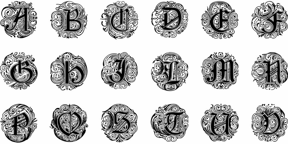
Source: GDJ/Pixabay
Using Shading Text
It may seem like a good idea to make one or two sentences stand out, but it can be distracting and make the reader lose focus on your main point. It is best to try not to use these techniques anyway as they are very cliché and will likely seem unprofessional to those who really care about design.
When you only use two font styles, such as Helvetica (regular) and Georgia (bold), then it is okay to have one or two sentences in bold. However, if you are using more than three font styles then it is best not to use any.
If your pamphlet can be easily read without the use of shading, then there is no need to add it in. If you do want to add some text and make it stand out, then you need to be careful not to go overboard. Try only using bold and italic brushes for good effect.
If you need a pamphlet maker app with the right font selections, Venngage is your best bet.
In Conclusion
Typography is an integral part of branding and can make or break your pamphlet design. If done correctly, it will help attract the attention of the reader and convey your message clearly. However, if not handled properly, font mistakes can leave readers confused about your pamphlet.