

Even if you’re not a professional designer, you probably can easily tell when you’ve visited well-designed websites and (maybe more so) when you have not.
The elements, or principles, of visual design, include Contrast, Balance, Emphasis, Movement, White Space, Proportion, Hierarchy, Repetition, Rhythm, Pattern, Unity, and Variety. Visual design components are extremely helpful in creating an aesthetically-pleasing website but they’re not absolutely necessary for every site out there.
Really successful websites (i.e. high converting websites) are ones that have a smooth, natural visitor progression, a user-friendly interface, ones that make a good impression with high-quality assets and have clear calls to action to point the user in the right direction.
Let’s dive in and take a look at all of the design elements in a high converting website.
What is Conversion Rate?
Conversion rate is the percentage of visitors that come to your website and achieve the desired result, like making a purchase, subscribing to your newsletter, or following you on social media.
Your website’s goal may be monetary, service-related, or just to collect subscribers (among others). A high conversion rate is the goal of every website, but it may not be the easiest thing to achieve.
Business owners know what their websites are all about but that doesn’t mean they know how their customers like to shop, surf, or learn. The key to building and designing a high converting website is to always, always, always, keep your user experience at the forefront of your mind.
User-friendly interface
A user-friendly interface is integral to a high-converting site because, well — if visitors can’t use it, they’re not going to buy from it.
Good design starts with the navigation bar. It’s one of the first things that people look at and it helps them get an idea of what information your site contains and what services you offer.
One of the most important parts of a website (or any business, for that matter) is making sure your customers understand the steps that they’re taking and the options they have. Giving too many options, however, can lead to visitors becoming confused or frustrated — maybe even exiting the site entirely.
Keeping your website clear of excess information and focusing intently on the customer’s journey are the two best ways to design a high converting website that visitors will keep coming back to. This leads us to the next design recommendation…

Minimalist design and text
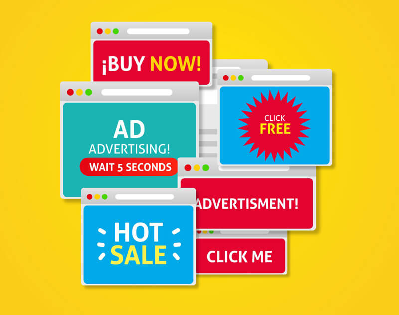
Let’s keep things simple! We’re way past those busy sites from the late-90s with music playing in the background and 12 different animated fonts flashing across the screen.
Today, really great website design truly embraces simplicity. Clean lines, lots of white space, and important information in plain sight are the fundamentals to stick to when designing your website.
Design simplicity in a website ensures that there is no clutter or useless information to confuse visitors. With everything focused on the outcome, the key message, and an aesthetically-pleasing visual experience, guests are more likely to respond positively to your conversion goals.
Calls to Action (CTAs)
A call to action (or CTA) is a marketing term for encouraging or prompting a customer to take a specific action or make a purchase. CTAs can be anything from email sign-up forms, add to cart buttons, or even affiliate links.
Calls to action need to be clear and compelling, creating a sense of urgency for your visitors to feel the need to take an action right away. Large, attractive buttons in natural areas of the page that the mouse might scroll over during the regular course of a visitor’s interaction with your site are a perfect place to start.
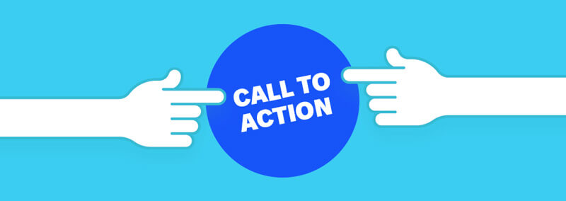
Call to action elements are key to driving visitors in the right direction. NoDepositExplorer does a fantastic job, employing strong wording and color (look at this page to see what we mean). Making sure there is no confusion with what you’re asking a visitor to do in your calls to action is the best way to create a high converting website.
Better design means more conversions
Whether you’re selling a product, generating leads or clients with a digital sales funnel, collecting email subscribers, or getting social media followers, more conversions mean profitability for your business. And it all starts with the right desigy7n.
Getting the design right enables your customers to click where you want them to click and take the actions that help your brand succeed. The more clicks, the more conversions after all.
Happy designing!