

As people’s internet connections become faster and their screen resolutions improve, more and more businesses turn to animations to capture user attention. In the past, animations appeared only occasionally and were often optional. Now, you’ll find moving features on a larger number of websites.
Motion graphics improve revenue. According to the State of Video Marketing survey, about 76% of marketers increased sales by adding animation elements to their campaigns.
People tend to love animations, perhaps because they enjoy video games so much. Companies find using them on a 404 Not Found page, for example, leads to fewer bounces. There are many ways you can utilize animations on your site to drive conversion rates upward.
The best way to learn how to use animated graphics effectively is by studying what other companies do on their websites. Here are eight excellent examples, including why they work so well:
1. Miki Mottes
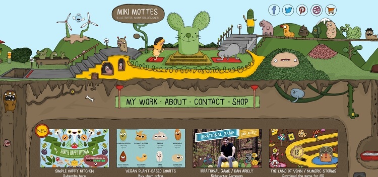
What better place to start the list of animated websites than on the page of illustrator Miki Mottes? The entire site is illustrated and interactive. As you scroll down, different creatures come to life with moving eyes, waving arms or lengthening bodies. The navigation moves with you as you scroll down the page.
If you want to learn how to add animated illustrations to your page, Miki Mottes’ site is a good one to study. Your website may only have a few moving pictures, but you’ll learn how to make everything work together seamlessly.
2. One Point Partitions
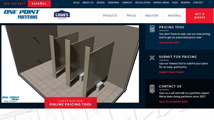
One Point Partitions offers an animated assembly video. People who might be uncertain about purchasing the product can see how easy it is to install. Rather than spending countless hours trying to get the right shot of an actual person putting the partitions together, the computer-generated example shows the product from multiple angles.
Do you sell a product or service that users need a little help with figuring out? An animated video may be just what you need to highlight the item’s best features.
3. Rollpark
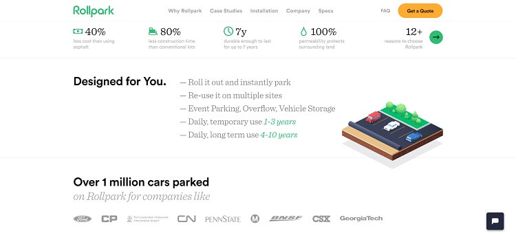
Even though they also have a video playing in the background, the animation magic happens on Rollpark’s website with the scrolling feature. As you move down the page, different elements drop into place, highlighting benefits one at a time through pictures and text. Even the photographs unroll like a scroll, mirroring the idea that their product rolls out, allowing cars to park on it.
They also point out benefits such as the ability to use their product at multiple locations and the length of time the item lasts based on usage.
Think about what physical motions people associate with your product. Can you reflect these associations in the way your animations move on your site? If the installation is as simple as sliding something into place, can you slide things from the sides of the screen?
4. Rino & Pelle
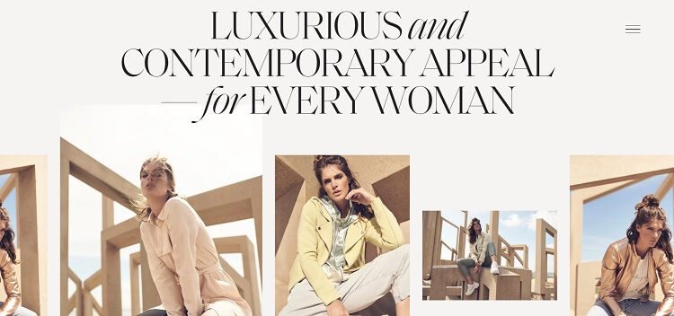
Even e-commerce sites benefit from added movement. Rino & Pelle offers designer women’s clothing. Note how the product photographs slide to the left as you scroll down. When you stop the movement, the images still scroll a bit more slowly while maintaining consistent motion — this adds interest to the page. The rest of the page has a parallax effect, where images move into place at different speeds.
You can add some interest to product shots by animating the way they arrive on the user’s screen. The visitor’s actions should dictate when the motion starts and stops.
5. Acura
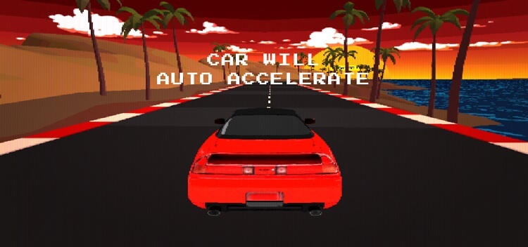
If you want to take things to extremes, you could take a page out of Acura’s playbook. They offer a game for users called “Beat That” where you test drive one of their cars on an animated game course. The game engages visitors from the first moment and encourages interactivity for several minutes. The platform helps their name recognition and offers their customers a brief respite from ordinary life.
Offering a game might not translate directly into sales, but it does drive traffic to your site and ties your brand name to something fun. Not everything on your website has to be about converting people instantaneously. It’s okay to have a little fun with your customers and provide them a memorable experience they’ll tell others about.
6. Trevor Blount Pilates
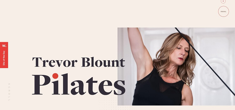
Your animations don’t have to be drastic to grab user attention. Look at Trevor Blount Pilates and the way they use animated circles to create an interactive element on their page. While images slide in from different directions as you scroll, you’ll also see circles move as you pass your cursor across the screen. The motion draws attention to the page’s different features.
If you want an affordable and subtle way to engage site visitors, consider motion hover as a way to add animations to your page.
7. Tula Microphones
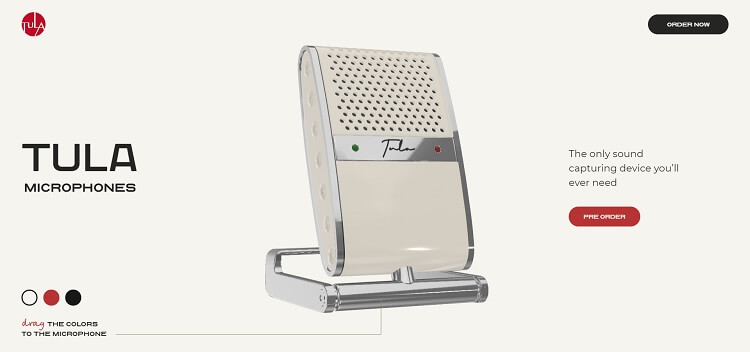
Tula Microphones adds an intriguing twist to motion graphics by displaying one of their microphones in a 360-degree video. The view highlights the product from different angles. As the user moves over the image, it tilts in sync with their movements.
A 360-degree video spotlights your products and allows people to have a simulated real-life experience. If you sell goods, a 360-degree video adds another level to your marketing efforts.
8. Kua Coffee
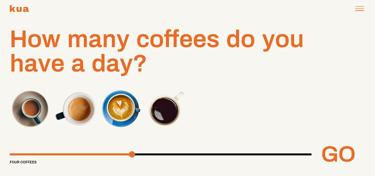
Kua Coffee adds an interesting motion graphic to their website. They provide a slider bar that brings in images of coffee mugs as you move the marker from left to right and back again. The optional feature adds animation but keeps it highly interactive. If the person isn’t interested, they can scroll down and ignore the slider tool.
Add elements that users aren’t forced to use to spice up your site. For those on smaller screens or with slower connections, the ability to skip past animation is an attractive proposition.
Using Animations
Animating parts of your website highlights essential objects on a page. Use them to engage site visitors and make your pages stand out from a competitor’s. With a little attention to detail — and with using techniques for how best to showcase your product’s top features — you’ll find motion graphics give your online presence a modern edge and increase conversions.

Lexie is a digital nomad and graphic designer. If she’s not traveling to various parts of the country, you can find her at the local flea markets or hiking with her goldendoodle. Check out her design blog, Design Roast, and connect with her on Twitter @lexieludesigner.