

With the increasing health awareness, less and less soda is consumed these days. Hence, companies like Coca-Cola suffers quite a lot due to this trend. And they are trying really hard to offer more healthy soda options such as their diet fruit COKE series. Not sure about you, I just can’t related the new branding with one of my favoirate company. I really miss that fancy curly Coca-Cola font. Might be not only me, other designers are aware that and the company as well. The traditioanl Coca-Cola looking comes back on their 2018 offical bottle design.
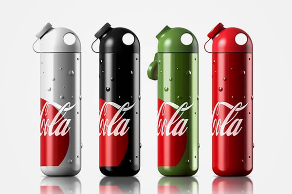
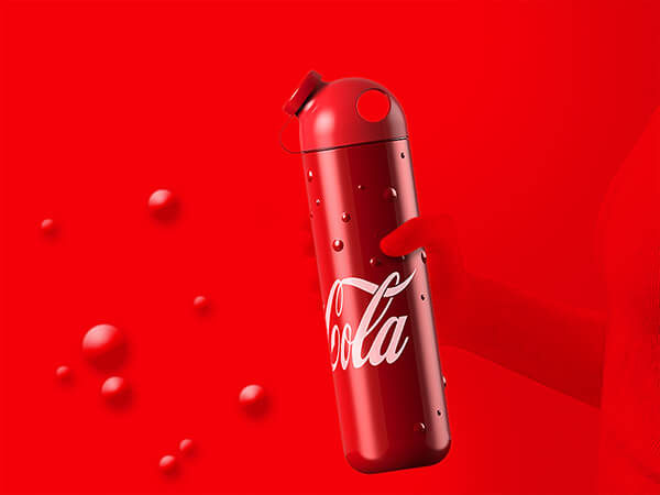
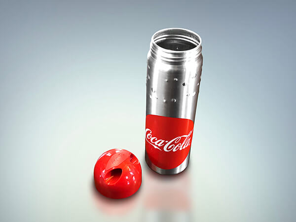
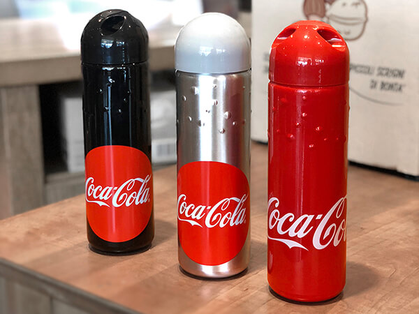
Created by Tommaso Ceschi, the design was chosen among 463 entries from a contest hosted by Elite. The metal bottle will keep hot drinks hot and cold drinks cold, whether you use it for your summer refreshment or your hot coffee in winter. A standout feature are its “built-in” bubbles that serve as both an aesthetic and functional element that enhances grip. Available in four different versions, Regular (Red), Light (Silver), Zero (Black) and Life (Green), there’s one to represent each Coca-Cola brand. It will be available for sale in many restaurants and shops along the highway network throughout Italy. Why only Italy?
via: behance
Why only italy ?