

2021 is the year of presentations.
With the global pandemic continuing to disrupt lives and work-from-home being the new normal, effective presentations are the only way to collaborate and communicate with teams.
This means, knowing the latest trends that the global workforce is hooked to is a great way to ensure your next meeting becomes a success. But the thing about trends is that they are not sustainable and change before you realize.
This means if you have to be efficient yet sustain the performance of your presentation, you need to mix your take with what is trending amongst the global workforce community. This will make your presentation stand out in no time.

In this post, we get into the details of every design trend that you can make your own in 2021.
7 trendsetters in presentation design that you need to know in 2021
Design is the silent yet powerful conveyer of communication. What we fail to say by words, the design does. This is exactly what today’s design presentation is doing.
At the core, our presentation designs echo our current state of mind.
The trends of presentation designs of 2021 are highly influenced by global circumstances. The where, when, and how we work have created a shift in how we present our messages. Right from colors to content layout to our choice of tools, everything has changed.
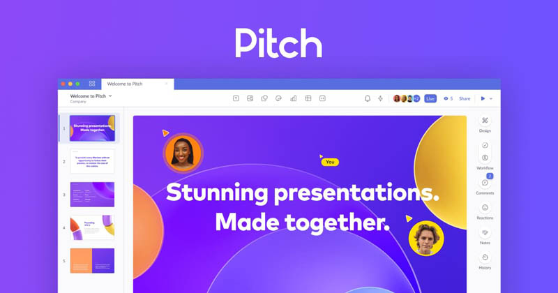
However, if you are still confused about how to approach your presentation, here is Pitch’s guide to presentation design that can simplify your journey.
In the following section, we have curated the top 7 trends to watch in presentation design in 2021.
1. Go beyond PowerPoint
Gone are the days when PowerPoint was the only presentation tool people used. With the competition of the SaaS market reaching new heights, you have a host of tools that can help you create the best presentations of your professional lives.
Tools like Envato, Canva, and many more are powerful, intuitive presentation tools that you can use today. These tools offer a range of pre-built templates that you can customize and used readily. But that’s not all.
They also have shareable links for easy collaboration and access.
2. It is all about visual storytelling
Images can convey a thousand words and this year’s trends proves that rightly. We see a meteoric rise in visual graphics-heavy presentations this year. If you did not integrate high-definition visuals in your presentation, you need to do it now.
When you’re presenting a slide, it’s very easy to go overboard on the words you use. Make sure that you’re using images to add emphasis to your points, and then you’ll start seeing a lot more people watching the presentation.
Text vs. image? In 2021 Images are dominant. This style is inspired by scrolling features while using social media.
For example, if you’re presenting the results of a survey, and you’re going to have a section of your presentation focused on why it was important to take the survey, make sure that you’re showing an image of what the survey accomplished.
If you aren’t already using responsive design for your images, you really should be. Responsive design means that the presentation is optimized for any viewing device, including mobile. Once you start using responsive design, you’ll start realizing that it makes the presentation look and feel a lot better.
That’s a basic example, but you can see how images can make a presentation more engaging.
It also makes the presentation much easier to view for your audience. You should be using responsive design to deliver a presentation more regularly than you are now. Responsive design is the future of presentation design.
While using the image and graphic design makes your presentation responsive. Making your presentation responsive allows you to increase your audience reach. Using social media platforms on mobile is a great start.
3. Content is the ultimate king
It seems pretty basic, but a great presentation starts with great content. It is the star of the show, rather than the design. The design is just a tool to make the content more engaging.
The key is to make the content so engaging that the design is completely unnecessary.
Make sure that you know what the content of your presentation is going to be, and then it’s interactive. That’s how you’ll end up with a great presentation. Also, ensure your content gains the spotlight. Going simple is a good idea to play with, but it can be dangerous too for you. Better play safe side and use color contrast. If your background and text color are blending, give a highlight by using stroke and bring your hero in the pitcher.
4. Don’t underestimate the power of serif
You may find this contradicts with trends. Design and font go hand in hand. You may urge to use fancy fonts, but they will create a negative impact and make your audience lose interest in your slides.
Why? Because fancy fonts give your presentation a modern look, but it reduces the readability rate of your content.
Looking at these things, 2021 will be a serif year. The Serif font family has been between us for a long time, and it is expected that they are going to be around us.
Why are they still in trend? The answer lies in their age; serif gives us a feeling of retro. The feeling of old, warm, which we all were craving for in 2020.
5. Keep it simple
Keep it simple and stupid. The straightforward rule of KISS is to hold upright in this year’s presentation trends. If you’re still in the habit of going over the text limit, you’re making a really bad habit of yourself. The good thing is that people are starting to become a lot more aware of that in today’s presentations.
Don’t make the mistake of filling your slides with lots of content. You will use your audience’s attention. Make your presentation design appealing to your audience. Glue them with your right voice modulation and engaging design.
Of course, some people love to go over text limits, but most people hate it. A presentation that is full of content is going to feel like it’s boring to them. Don’t let that happen to you.
Pro Tip: Get a hold of your content and let your design make noise.
6. The dark background rises
With the pandemic creating a shadow in our lives, dark backgrounds have made a come back too. But a presentation doesn’t need to look monotonous. You can use different colors and choose the colors that you use in the presentation wisely. A presentation that doesn’t use different colors is going to look stale and boring.
It’s easy enough to use different colors, but you need to make sure that every presentation is unique. You can’t just use the same colors all the time.
What puts the base for presentation? Background! Going with a dark background will give you an ample amount of opportunities to spotlight your content. 2021 is the year of presentation design painted with dark and neon colors. You can use multiple ideas and pattern blends with a wide range of colors.
Different colors depict some feelings. Using a dark color background such as black gives you a feeling of seriousness, bold on the other, and sad, lowkey. The perfect definition of emotions we went through in 2020.
Play with variants, go neon and blend things to create 2020 inspired presentation design in 2021. Neon acts as a booster, and we often see them used with retro themes.
7. Being human
The year of the pandemic has been everything but human. If there is one thing that the world craves, it is the human touch. This year’s presentation designs loudly reflect this craving. This means the best thing that you can gift your audience is the warmth of human emotions. But how?
Enter doodles. No wonder why these hand-drawn illustrations are becoming rapidly popular in the presentation world. Inspired by DIY areas created by using different graphic tools, the central idea behind doodles is to showcase creativity with color and graphics. Does Google Doodle ring any bell?
Google doodles prove that gigantic cooperation can also add doodles to create friendly and interactive elements in their slides. Doodles are always a right-minded idea to add in slides. They can act as side heroes or can be introduced as main heroes.
Conclusion
Presentations are all about impactful expressions. This means if you have to truly stand out, only following trends will not make it a success. You need to go deeper.
Be authentic in your presentations. Be bold and show your style. Let open your creative outlet and bring the best versions of you. Sure, you can use the above design trends to set the mood board but always take into account your context and target audience.
The more aligned each of the elements is, the better is your end output.
So now, when you know the trending presentation designs of this year, there is just one question left to answer.
Which design trends are you thinking of implementing in your next presentation?