

It isn’t enough for a product or service to be good anymore, it should look good too. This is the new struggle that new brands have to face today, especially when they are vying for the top spots in the online realm. For instance, the fonts alone can make a bid different in the overall presentation.
There is no dearth of both free and paid quality fonts on the Internet. However, which ones should you choose for designing your websites, logos, social media banners, etc.?
Let’s take a look at 5 amazing fonts that are especially popular among the professional designers even today:
1. Exocet
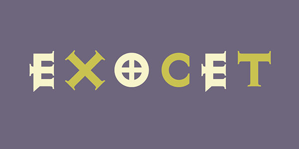
Exocet is heavily inspired by Roman and Greek letter carvings and uses geometric shapes for impact. For instance, the letter O has a cross inside which is an early form of theta.
Although Exocet was designed in 1991 it’s still quite popular among designers as it has both modern and ancient elements that kind of make it a “classic”.
You will find Exocet at many places including Star Trek: Nemesis, Demolition Man, and even the popular video game Diablo.
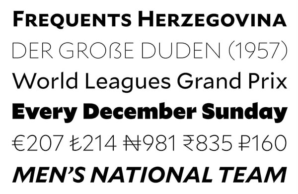
2. Oswald
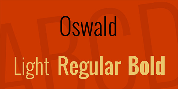
Oswald is another popular choice among designers especially those are in web design. Although it being free is one of the main reasons why it’s widely used across the globe, it’s also a rework of classic style inspired by the alternate Gothic sans serif typefaces which make it so appealing and interesting.
In today’s competitive online space in which hundreds of new startups emerge on a daily basis, it’s important to learn about branding and things like how to use fonts in logos. However, Google’s web font Oswalt is a good style to look into for those who are new to branding.
3. Avenir
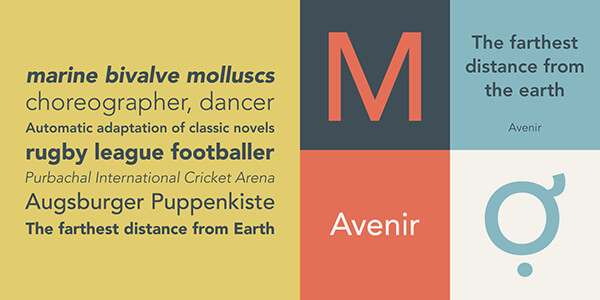
Avenir was designed in 1988 by a famous Swiss typeface designer called Adrian Frutiger who was known for designing impeccable signage systems and maps for clients as big as IBM and Air France.
Avenis is often described as a reinterpretation of polished geometric designs of sans serif of the modern times. It can be found with many popular brands including Apple Maps, Samsung Galaxy, etc.
4. Proxima Nova
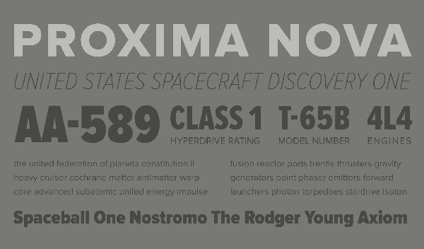
If you use the Internet, then you have seen Proxima Nova. After all, from Mashable to Buzzfeed, more than 25,000 top websites have used this simple yet powerful font.
Proxima Nova aptly fits the category of high-quality affordable font for creative people and for many good reasons. For starters, it’s available in 7 kinds of weights viz. thin, light, regular, semi-bold, bold, extra-bold and black. Its qualities in terms of spacing, proportions, etc. and the “friendly” feel it gives with the circular and open forms are also what make it so loveable and ideal for websites and logos.
5. Mallory
Mallory is a product of Tobias Frere-Jones, a distinguished designer and a teacher. It’s essentially a professional font with a unique artistic appeal which is a great combination really.
In the words of Frere-Jones himself, Mallory was “built to be a reliable tool, readily pairing with other typefaces to organize complex data and fine-tune visual identities”. You can expect a huge variety of styles with the glyphs alone available in over 1200 variations. There are punctuation letters for headlines and an impressive range of currency symbols for your financial content too.
Conclusion
With the blogosphere having exploded, today we have a ton of websites, blogs, social media pages and all kinds of online entities. Thus, it’s easy to lose your identity on the Internet unless you use the right branding elements which includes the fonts. That said, the ones discussed above should be able to nudge you in the right direction. Good luck!